A Refreshed Look: How SmartBug Developed a Transportation Company’s Brand Architecture and Logo
Overview


I love that I can rely on SmartBug to help us grow, and ultimately take our company to the next level. I appreciate everything they’ve done so far and am excited for the future.


Developing a New Brand Architecture
SmartBug collaborated with Boaz to identify the company’s rebranding goals. The design team developed several different logo ideas and a consistent brand architecture for its domains.
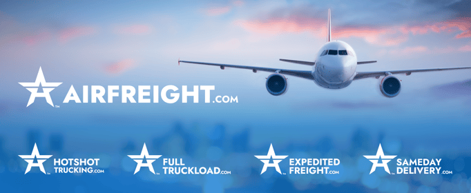
First, SmartBug focused on developing AirFreight.com’s brand architecture. The design team walked AirFreight.com through the various brand architecture systems and built out the brand using the masterbrand approach after obtaining a clear understanding of the company’s long-term goals. Then, the team helped AirFreight.com classify its various domains and sub-brands, establishing AirFreight.com as the parent company.
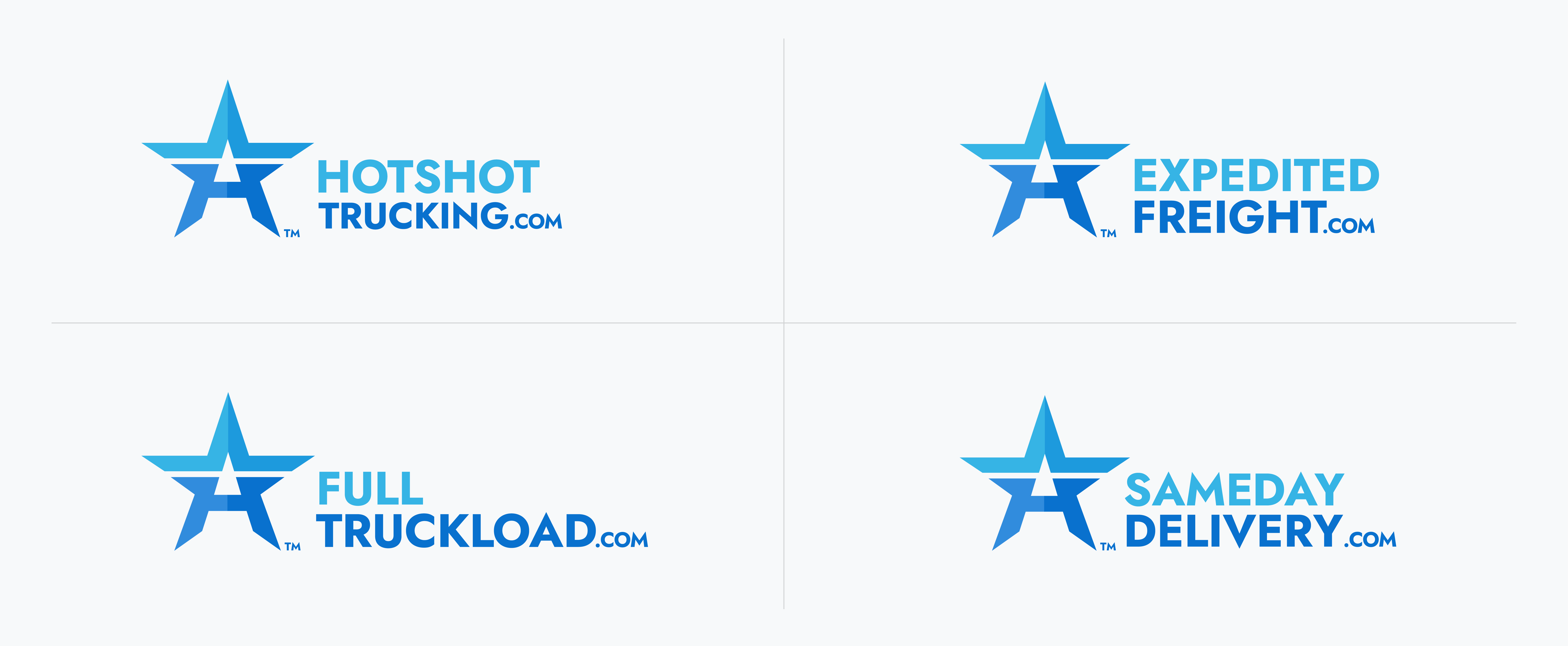
 The team then implemented a star logo blended with the letter “A” to highlight brand unity across AirFreight.com’s websites. SmartBug’s design team also developed an expansive palette of blue shades. After discussing the color selection, SmartBug brightened the palette, which was exactly what AirFreight.com was looking for.
- Website Development
- Logo Development
- Brand Architecture Development
- Visual Branding Work
The Results
Brand Unity and More Streamlined Logo
With a new logo, brand architecture, and updated visual branding work, AirFreight.com has dramatically boosted its online presence and created a unified appearance across its many websites.
By helping AirFreight.com build out its brand architecture, logo, and visual branding, the SmartBug team has helped AirFreight.com establish itself as a leading business in the expedited freight and logistics industry.