


August 1, 2017
The Anatomy of a Rebrand
Rebrands can be tough. Between determining strategy, developing a new visual style, redesigning the website, and—perhaps most importantly—aligning all decision makers, it seems as if there are a million things to consider. And of course, the public perception of your company hinges on all of these efforts.
When we embarked on rebranding SmartBug Media, we approached the project as we would with any client project. We knew that to make our rebrand successful, we needed to cross our t’s and dot our i’s. We knew that by doing our due diligence, when we launched our new website and introduced our new brand to the marketplace, our hard work would pay off.
Knowing Where to Start
Before beginning the rebrand, we had a working session in Irvine, Calif., to establish clear objectives. This was the time for some soul searching. Organizations rebrand for numerous reasons. For example, an organization may want to reach a new audience or increase its relevancy in the market. We needed to figure out our game plan.
To do this, we asked ourselves two simple questions:
- Why are we rebranding?
- How do we measure success?
The answers to these questions, as well as outlining our one-, five-, and 10-year goals, set the course for how we approached the project.

Doing Our Research
After establishing our objectives, we augmented these goals with research. We started by conducting stakeholder interviews with the leadership team. This gave us a thorough understanding of where the company was and where the key players from each department saw it going. By asking each team lead the same set of questions, we saw clear patterns emerge. Stakeholder interviews are particularly valuable because they can introduce new ideas, as well as raise possible red flags that could hinder a project’s success.
In addition to stakeholder interviews, we also conducted a brand audit—a detailed analysis that shows how your brand is performing compared to your goals. It analyzes the current story a website is telling—and how it compares to the story your company wants to tell.
We asked ourselves the following questions:
- Who is our audience?
- What is our purpose?
- What are our values?
After answering these questions, we analyzed recent customer interviews and reviews, revised our personas, dove into our current analytics, and performed a site content audit.
Positioning Ourselves Accordingly
One of the huge benefits of a redesign is that it allows you to re-evaluate your current positioning. Your website should not only tell a story, but also show success. Besides identifying areas for improvement, you must analyze how you are perceived by your clients. Through research, we discovered that our previous website didn’t entirely explain who we were. So we set out to change that.

We knew that we had built our initial success around our inbound marketing expertise. Our old story—and website—centered around this concept. Although our clients could tell you that we served as an extension of their team and provided them with inbound strategy, our website did not highlight the successful results of our work enough, or tell a comprehensive story of the services we offer.
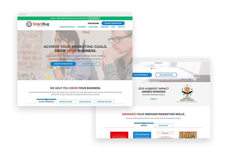
Fast forward to 2017, and our story has evolved. We knew that the inbound world was changing—and we realized that we needed to separate ourselves from the pack. In addition to adding employees, we’ve added new services.
These days, we’re a go-to partner for services across the board: from PR, to creative, to marketing, to development. Our rebrand and site redesign aim to tell this new story.
A Whole New Look
We did our research. We gained consensus from the key players. Now it was time for the fun to begin.
We began by looking at our competitors and scouring the internet for inspiration. But before diving into design work, we first established design principles to inform the creative we were building. Our principles are:
- Modern: SmartBug is an industry leader. Our visual design will reflect this.
- Clear: Our visual style is simple and easy to understand.
- Human: We live by our values and we value our people. Our design will be amiable and open.
- Unified: Our tone and design will be consistent across mediums, contributing to the overall voice and visual identity.
With so many pieces of collateral needed for a rebrand, and a million possible creative directions to go in, these principles provided much-needed guidance.
Once we had our principles in place, we kicked off the design process by exploring logo options. During that initial research period, we determined a direction for the rebrand. But once we saw that direction applied, we realized it didn’t quite align with our ultimate goals.
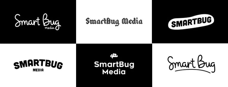
So we had to pivot. That may sound like a bad thing, but neither that time nor work was wasted. Design is all about exploration and iteration. There were some aspects we liked about the first logo concepts, but talking through what wasn’t working allowed us to coalesce around a new direction.
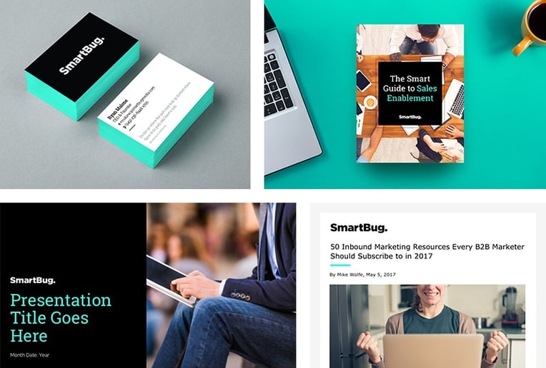
We wanted our logo to concisely convey that we’re experts in our field and we’re confident in what we do. We realized if we wanted to truly differentiate ourselves in the industry, we needed to be bold. Strong. Declarative. Our clients look to us for finality and confidence in our recommendations, and trust that the work will get done the right way—the first time—so we needed to represent that visually.
Ultimately, we realized simplicity was the key to our new look.
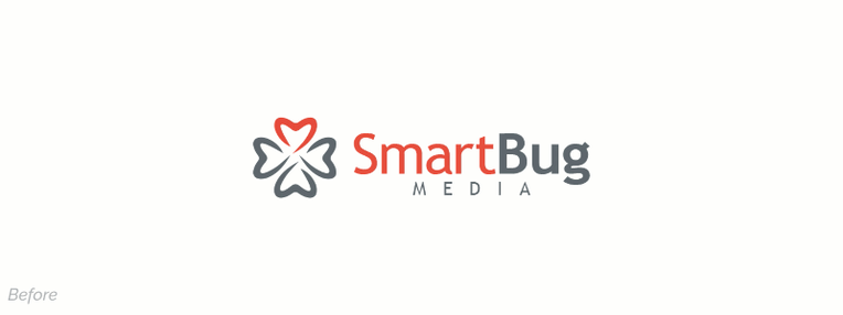
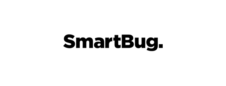
After some testing, we determined the word “Media” was confusing to users. Dropping the word from the logo helped clear that confusion, yet didn’t alter how users found us online. So we simplified the wordmark. Adding a period at the end transformed the word to a statement. It fit the new direction perfectly. Pairing this with a bright, bold color palette was a fitting complement.
This is where the design principles we established in the beginning of the project came into play. We knew that strong brand colors would ultimately require restraint. With our principle “Clear” in mind, we wanted to keep our expertise and client work the focus, while the brand identity and website design support that fundamental message. From there, the rest of the visuals fell into place.
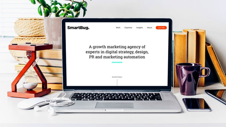
These same principles translated to the website. We wanted the visuals to be secondary to the message, so our developers coded an experience that builds out our story as the user navigates through the site.
Launched and Loaded
In the end, we created a new brand that fit our new direction, and we’re incredibly excited to share it with our clients and the market. Rebranding a company and redesigning a website takes a village. As we’ve mentioned before, there are numerous internal stakeholders who are involved in the process. Sales identifies pain points felt by customers. Marketing outlines personas and verticals to target. And designers and developers put in the blood, sweat, and tears to turn an idea into reality.
The launch of the new brand and website doesn’t mean this is the end. As the site lives and breathes, we’ll continue to update, test, and iterate so we can learn and improve. Our work is never truly over—but that’s part of the fun.


Plan, design, build, and launch your website successfully with:
Mastering The Art of Website Redesigns


Other Insights You Might Like
-1.jpeg?width=800&length=800&name=032922%20A%20Day%20in%20the%20Life%20of%20Working%20at%20a%20Remote%20Agency%20%5BParent%20of%20Teenagers%20Edition%5D%202%20(1)-1.jpeg)
-png-1.png?width=800&length=800&name=Untitled%20design%20(12)-png-1.png)
