November 16, 2018
A brand style guide captures your company’s identity and personality. From your colors and image preferences to typography and iconography, to graphics and more, a style guide dictates how your company looks to the rest of the world and how the world will perceive who you are. If your brand comes across as inconsistent or disjointed, you can easily confuse and alienate customers and clients.
Think of your style guide as your brand’s insurance policy. It makes sure that your company’s identity is conveyed consistently and cohesively across all mediums and assets—whether something is designed internally or externally, and whether something is online or in print. Most companies opt for a fully comprehensive style guide that digs deep and covers every aspect of the brand, including:
- Design standards (color, fonts, images)
- Web guidelines (UI, form components, animations)
- Messaging and content (tone, voice)
For this article, we’re going to focus exclusively on the design portion of a brand style guide with our recommendation for seven best practices to follow.
1. Get inspired
If you’re feeling overwhelmed and not sure how to get moving, throw some visuals on a mood board—whether live and in person on a posterboard or by using a digital app. Here are a few ideas of things to include:
- Color combinations
- Images
- Font types
- Screenshots of UI elements from websites you like
These items can set the visual stage and help you pinpoint your brand’s tone. For an example, here is a mood board that we have created for one of our clients using Invision. There are many ways to interpret and produce a mood board, which you can get a taste of just by Googling.
Also, make sure you have all of the right people in the room for this process. One way to involve everyone at the company is to have each team or department create their own mood board based on how they view or feel about the company.
This process can uncover some great insight into company values and any questions that might be coming up about the brand’s identity—visual and otherwise. And, perhaps most importantly, this process will help get stakeholders to agree on the same elements and keep everyone on the same page moving forward.

2. The logo
One of the most basic assets to include in your style guide is the logo. But beyond just displaying what your logo looks like, your brand guide should include the following:
- Sizes and layouts in which the logo can be displayed (e.g., horizontal, vertical, square)
- Various color options in which the logo can be displayed (e.g., black and white or inverted colors)
- How not to display the logo
If you don’t have these variations firmly displayed in a style guide, a designer or developer might take the logo and remove an important tag line or change the color or size so the logo is no longer recognizable and on brand. Showcasing the dos and don’ts for your logo will inform others on how it should be properly displayed.
Don’t have a logo yet? Take a few minutes and read our take on how to decide whether to use a DIY site or hire a graphic designer.
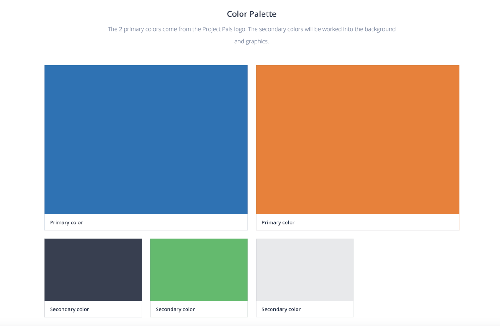
3. Color palette
There are some common best practices for choosing brand colors, and they might be based on your current brand assets or you might be completely redesigning your brand identity. Here’s what your style guide should include:
- One primary color: Preferably something from the logo for cohesiveness that can be applied to important CTAs and headlines
- Two secondary colors: Also known as accent colors, these colors should be chosen for graphics, secondary CTAs, and fonts
- Background colors: Choose a few background colors for contrast, such as a light blue or gray for certain background sections and a dark gray for fonts
Don’t go overboard when adding colors. More than 85 percent of online shoppers make a purchase decision based on color, according to brand expert and influencer Neil Patel, so take the time to understand your audience and the product or service you’re offering in order to pick the right colors. Another helpful tip: Look at your competitors to see what they’re doing right with colors and what they’re doing wrong.
If you’re not sure where to get started with your color palette, take a deeper dive into the psychology of colors with Neil Patel.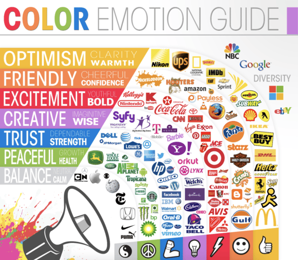
Infographic by The Logo Company
4. Typography
Fonts can distract a reader or, alternately, make content more digestible, so take time to showcase the right ones. A reader typically makes it through seven to nine words before needing to pause, so you want a font that doesn’t hinder the reader’s ability to get through the text.
Additionally, fonts have the ability to make people feel certain things about your brand, so ensure the typeface you choose is right for your product or service offering. Making sure it’s readable is also important. Here are the four most common font types:
- Serif: These fonts feature letters with short lines (serifs) coming off of the edges and are considered to be more formal. They’re great for print.
- Sans serif: These are fonts without serifs that are viewed as playful and informal. They’re great for digital because screen resolutions are not as fine as in print. (Note: As screen resolutions improve, serif fonts are showing up in more places online.)
- Script: These fonts resemble handwriting and are not ideal for body copy.
- Decorative: These are fonts that are informal and viewed as original or unique. They’re best for headlines, but avoid using them in body copy.
Once you’ve got your font choices down (did you run a 1Il test?), make sure your style guide has everything your designers and developers need to know about how to use them, including:
- Specific font weights
- Correct sizing
- Font colors
- Sample paragraphs and headlines
- Line heights
If the font family is premium, it’s good to showcase the web-font alternatives. Best practices suggest limiting your style guide to three fonts. If this seems too limiting, play around with varying weights to create visual hierarchy, but avoid going overboard. If you’re unsure about what fonts to use, Canva has a great sample of 20 font combinations that can inspire your style guide.
5. Imagery
Is your brand fun and funky? Is it more subdued and professional? Are there people in the photos, or are images primarily for illustrative purposes? Include examples in your style guide of the types of images your brand uses and those that it should definitely avoid. Although this is one of the most difficult parts of creating a style guide, it can help set your brand’s voice and tone.
Here are a few more questions you can ask to get a better idea for what types of images best represent your brand:
- Do your images have a specific lighting style or color tones?
- Is it important to have actual people in the photos?
- Is stock photography okay to use?
- Is diversity important?
- Do you like showcasing your company’s platform on a laptop or mobile device?

It’s also recommended to showcase examples of images you don’t want to use, because this helps avoid revisions and endless photo searching in the future. If you’re not sure where to start, spend some time on sites such as Pexels or Unsplash to find free, high-quality images that line up with your brand identity for your style guide.
6. Graphics and icons
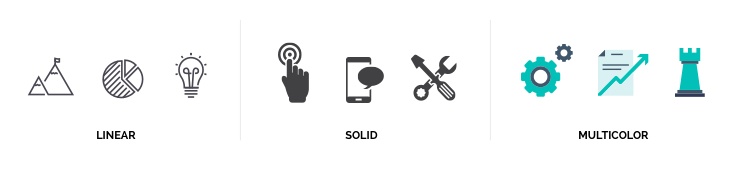
In addition to imagery, most brands have icon styles ranging from super simple to incredibly elaborate, including illustrations. These icons can help set a brand apart from the pack and are usually detailed in your style guide according to specific colors, sizing, and placement. If you opt for simple icons, are they linear or solid? Are your graphics more illustrated and need to be customized for the content? The details of these elements are also essential to know if you’re relying more on graphical elements than photography alone.
7. Style guide
Style guides don’t need to be a certain length or number of pages. In fact, the size of your stylebook will vary depending on how large or established your company is, as well as how much time you’ve put into already codifying your brand identity and style.
Whether your style guide is a one-pager with details and examples, an extensive PDF booklet, or a full-on digital catalog, make it comprehensive but concise. If your guide is too lengthy, you could inadvertently prevent your teams from finding the right information to tackle a project. On the other hand, if you don’t provide the right amount of detail about best practices and use, your brand identity can become fractured and confusing to your audience.
Getting Started
At the end of the day, creating a brand style guide is all about ensuring consistency. Make sure your style guide is accessible to everyone at your company and that it stays up to date. If you find that you’re getting the same questions over and over again about the best practice or style on something, update your style guide to reflect the answer so everyone can work more efficiently.

Plan, design, build, and launch your website successfully with:
Mastering The Art of Website Redesigns


Other Insights You Might Like

-4.png?width=800&length=800&name=Untitled%20design%20(1)-4.png)