July 24, 2019
One of the common questions marketers ask themselves when starting the e-book creation process is “how can I make this so awesome that people will want to read it, stay engaged, and share it?” That question applies to designers too, and hopefully, by the time you have finished reading this blog post, you will have all the tools you need to create that awesome piece of content for your readers!
So let’s get to it! What does it take to create an awesome e-book?
1. Check the Manuscript
One of the first things I do when starting the e-book creation process is read the manuscript. Doing this gives me an overall feel for the topic, but along with that, it lets me see how the document is broken up, where the main headings and subheadings are, and how many chapters I’m working with. All of this is helpful for establishing the document’s structure, and it can also get the gears moving on things that will come further down the road in the design process, such as imagery, iconography, and typography. Quick tip: Don’t forget to ask any questions you have before getting too far into designing!
2. Decide on a Layout
Throughout my career as a designer, I have come across many different e-books with a variety of layouts. Let’s assume for this example, however, that we are creating a traditional e-book, 8.5 by 11 inches in size. The first thing you want to decide is the orientation.
The type of e-book you want to create will be a huge factor in this early decision. Portrait orientation is more traditional and will also be very mobile-friendly, but if you want to create an e-book that's very visual with large imagery/graphics, then landscape is probably the way to go. How you want the reader to consume your content should always be at the forefront of your mind when creating an e-book. If any of your decisions at this stage will make it hard for the reader to consume your content, take a breather and rethink your choices.
Quick tip: Once you have chosen your orientation, you can determine how you want the text to look. Single column, double column, or even a combination all work well. Again, it depends on your audience. If you know more than half of them will only read this e-book on a mobile device, then you should use a single column layout to avoid them having to pinch and zoom.

3. Create a Clear Hierarchy
At this stage, your script is ready and you have decided on your layout for the e-book. You are ready to start designing! As you begin to design the copy, make sure you put a clear text hierarchy in place. This can be done by using different colors or font weights. You can even consider using a different font entirely for the headers. Just make sure that the reader can clearly identify when a new section begins and can also tell the difference between headers and subheaders. Quick tip: I typically recommend using no more than three different fonts for your e-book.
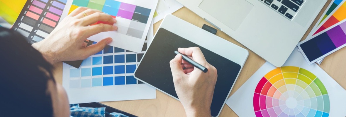
4. Choose Your Visuals
Although having a clear hierarchy for your copy is important for the reader, it's the visuals that dictate the look and feel of the e-book, and ultimately, will determine how impactful and memorable your e-book is.If you are using stock photography, avoid images that are cheesy, awkward, and overly staged. If the subject matter is business-centric, try something more candid that features businesspeople and their interactions. If you need a more tech-based look, I’ve found abstract images and patterns to be particularly effective. There are good stock options out there—I promise you that. You just need to dig a little deeper. Here are some great (and free) stock image websites:
(Note: Some photos may still require attribution so do your research and determine how these images can be used.)
You will also want to include iconography in your e-book to give it a little extra visual punch. I find that icons make great alternatives to bullets or for breaking down types of services or segments of a business. Just remember that you want to keep your consistent look, so pick a style from the get-go and stick with it. Don’t mix and match icon styles because that can be confusing to your reader. Quick tip: Large imagery can make great section dividers or breaks in content. Try combining an image page with an important call-out to create an impactful break from all the text.
5. Call Out Those Call-Outs
OK, I agree! This could probably have been included in the visuals tip above; however, I think call-outs bring an important dimension to e-book design and are somewhat undervalued, so im giving them their own section!
There are two main reasons to use call-outs in your e-book design. The first is that they are a great way to break up the body copy of a page and highlight an important statistic or quote from a leader in the industry. The second reason is that they can be used as an additional visual on the page to accompany the imagery and iconography.
Call-outs should be larger than the body copy and should also have a different font weight and color to make them more eye-catching. After all, you want your reader to see these highlighted points. Here is an example of a well-designed call-out that fits the overall aesthetic on the page.
Quick tip: When styling your call-outs, see if you can pull in some of the company branding. This could be something from the logo or any shapes that are part of the overall brand.
And that's a wrap! Hopefully, these tips help you create your own awesome e-book. They are great ways to engage your audience and gain some brand awareness.

Enhance your writing and editing in digital marketing immediately with quick tips from:
How to Write (and Edit Yourself) Like a Rock Star


Other Insights You Might Like