November 6, 2019
A company website is many things: It's your 24/7 salesperson. It's the home for all of your marketing content. It's the place where people can read about your company history, offerings, and case studies. It's the visual representation of your brand in the digital age.
Most importantly, though, it's where your leads convert, giving you the opportunity to win their business—and grow yours.
Essentially, how you're represented and how good the user experience is can be the difference between an unknown visitor bouncing and a lead becoming a customer. The aspects of website design have a direct impact on how visitors behave on your site, and although there are many ways to design a website that converts, to begin, let's talk through four tactics are effective starting points.
Homepage
Your homepage is the face of your business. (And if you're like HumanGood, you have two faces at the top to represent your company.)

Homepages usually bring the most traffic to the site—unless you have interior pages or blog posts that are a goldmine for SEO or you're pushing paid dollars to it—so it needs to be visually appealing and have clean, concise copy.
Your visitors should be able to quickly understand your value proposition and find what they are looking for, whether it be a CTA in the top module or in the navigation.
Keep in mind that visitors will be accessing your site from a range of devices, and if your site isn't responsive, or designed to display appropriately on all devices, it can easily turn potential leads away.
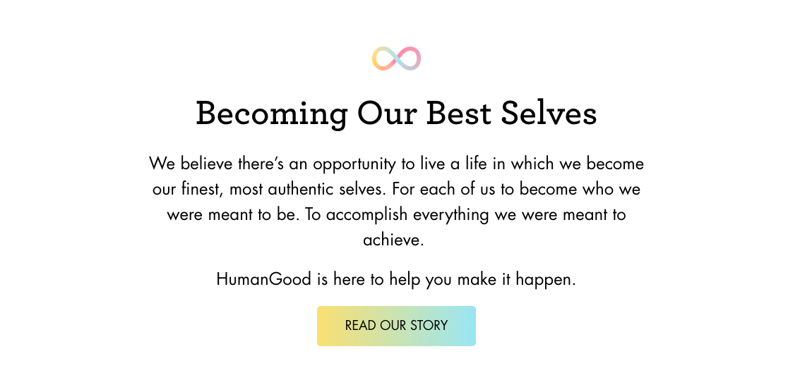
HumanGood is a great example of how to create a simple yet effective page. Its messaging is clear, supported by the slight use of animation and balance of text and imagery.
As visitors move down the page (nudged to do so by slight visual cues), they're told a little more about the company's story, and there are a few places to learn more and connect with what they offer, creating plenty of opportunity to convert visitors into leads.

Landing pages
It might be obvious but still going to mention here—you need to have an optimized landing page, and there are several elements that effectively convert visitors.
As with your homepage, you must include a strong headline and description of what visitors will get from your offer, what problem you will help them solve, or what to expect.
However, one major different from your homepage is that you should not have a navigation or any other menus that can detract from the goal of the page. For lead generation purposes, you want your visitors’ attention focused strictly on a call to action or form. (Also, your form shouldn't ask too many questions or have more than seven fields.)
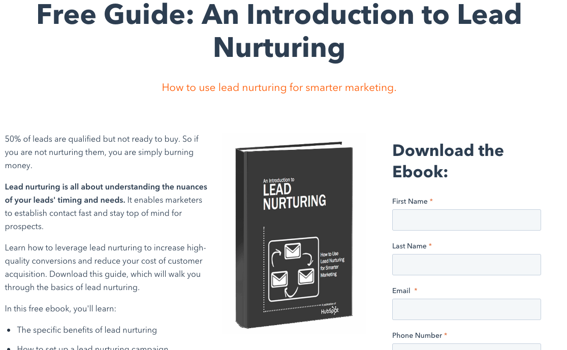
Take a look at the above example of HubSpot's "Introduction to Lead Nurturing" landing page.
The design is simple, featuring the guide's cover, and it only has a few fields to fill out. The company outlines the purpose of their offer, how it can be used to the downloader’s benefit, and a few of the key questions that readers can expect the report to answer—all the more reason to covert.
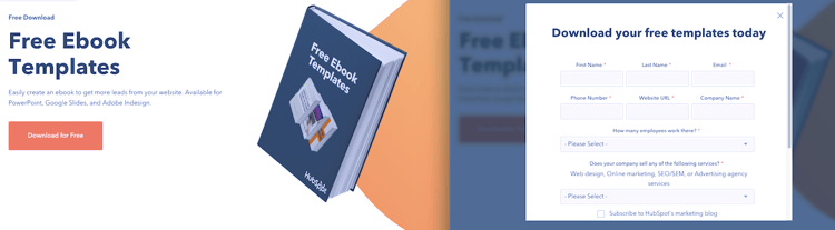
Bonus: Take a look at this other page style for HubSpot's "Free Ebook Templates" offer, where they choose to do a CTA and a pop-up form instead of the more traditional landing page style above.
Call-to-action
A call-to-action (CTA) has a significant impact on your conversion rate, as it is the mechanism that brings visitors from the "just looking around" phase to the "I want this now" phase.
Make it so easy for visitors that they can't help but reach out—include CTAs on multiple site pages as well as on your blog posts. Best practices for CTA design include using colors and copy that are visually appealing, and you need to incorporate action-oriented words such as“register now” or “learn more.”
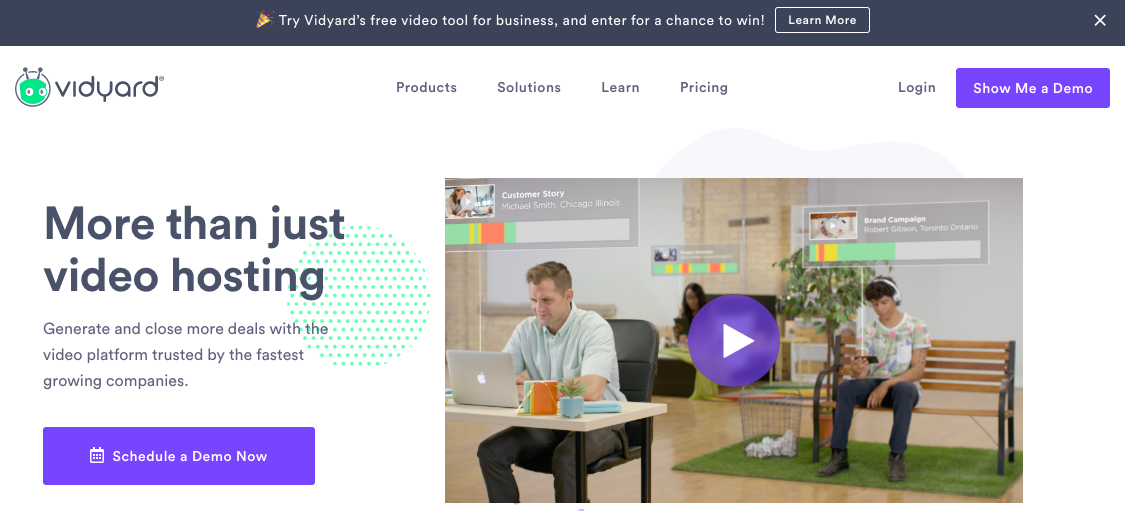
Vidyard's homepage has two unmissable CTAs that urge visitors to get a demo of their tool, and the one in the navigation shows throughout the user experience of the site. The minimalist design and color draws the eye right to the CTA buttons, even if they're at the end (or middle) of blog posts and other pages.
Blog
Although maybe not thought of as a conventional design tactic, incorporating a blog into your website is crucial to lead generation nonetheless.
Your blog attracts visitors, improves SEO for your site, and helps to establish you as a subject matter expert—all leading to an increase in conversions.
Instead of showing you another website, take a look at our own CTA within this blog post.
That is an example of a text-based CTA that you can use regularly throughout your content. (And by the way, feel free to click on it and check out our guide!) It's a great way to break up long stretches of content with relevant and helpful information while generating more leads for your company.
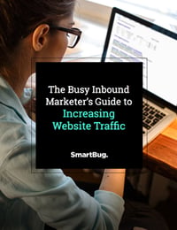
Need another example? Check out the image-based CTA for "The Busy Inbound Marketer's Guide to Increasing Website Traffic" below.
This post was originally published on June 10, 2016, and was updated on November 6, 2019.
Learn how to attract the right traffic to your website for maximum return on investment with:
The Busy Inbound Marketer’s Guide to Increasing Website Traffic


Other Insights You Might Like