August 20, 2015

Just like any other page on your website, your homepage has best practices to move your website visitors down the funnel and to convert. When guests come to your home, what do you want them to do once they arrive? Do you want them to walk right into the bathroom that is attached to your bedroom? Probably not, but without proper guidance, they won’t know that. Homepages act in the same way by guiding your visitors with these best practices.
1. State Your Value Proposition
As already mentioned, you don’t have a long time to capture your users’ attention, so you must clearly state your value proposition on your homepage. Visitors should clearly see the value of doing business with you.
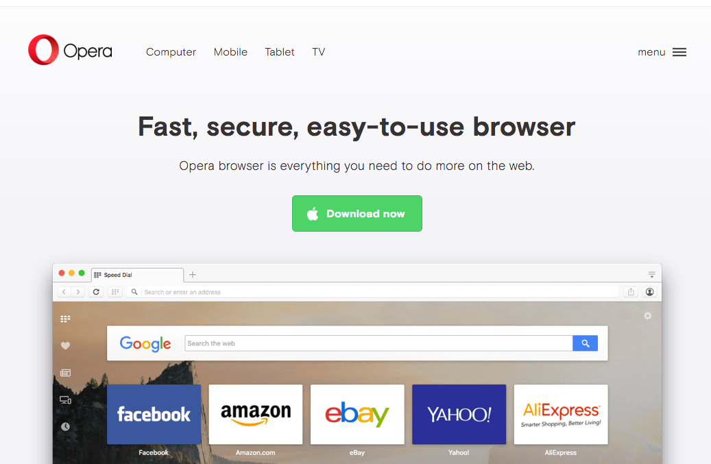
An example of a homepage with a clearly defined value proposition and a call to action is Opera.com.
 As you can see, Opera lets you know that it is a web browser, then also informs you that it’s fast and free. Just below that, there is a call to action to download the browser, with a reminder under the CTA that it is free.
Your value proposition should answer these questions:
-
What is this company/webpage?
-
When I’m on this website, what am I able to do?
-
Does this website help solve any problems for me?
-
Why should I choose this company/website over any others to solve my problems?
Without a value proposition clearly stated, your website visitors can get lost on/bored with your website and never convert.
2. Persona-Focused Design and Copy
When you think about marketing materials in general, whether they are mailers, brochures, billboards, and so on, the design and copy of those materials should be catering to the audience that they are trying to attract. Your homepage is no different.
After you have defined your personas’ pain points, your homepage’s design and copy should offer solutions. If you are able to, personalize your homepage to the specific person that is viewing your website. HubSpot’s Smart Content enables you to do just that. As you learn more about your visitors, you’ll be able to adjust the content of your website to be more personalized and relevant. With HubSpot’s Smart Content, you can customize content for first-time visitors, or customize it based upon where they are located, what devices they are using, or if they are a part of a HubSpot list. The opportunities with Smart Content are endless.
Remember, you don’t have a website for you—you have it for those you are trying to sell your product or service to. Delivering a positive experience to your desired audience makes sense, and that starts with persona-focused design and copy on your homepage.
3. Navigation
Your homepage’s navigation is possibly the most essential aspect of your website. Deciding what to include in your homepage’s navigation could be the difference in somebody becoming a customer or leaving your website immediately.
First and foremost, your navigation menu should be user-friendly. A menu that is hard to navigate or click is an instant turnoff for a potential customer, who then may be inclined to leave your website.
A few tips to keep your navigation user-friendly are:
-
Limit the number of top-level navigation items.
-
Keep dropdown menus to one level.
-
Limit the height of the header.
-
Denote dropdowns with visual cues.
-
Make sure it is responsive for different-sized devices.
Choosing the pages you wish to display in your navigation can be a tough call, but a good rule of thumb is to at least include:
-
The homepage
-
About Us
-
Contact Us
-
Blog
Remember, your homepage’s navigation can be the difference between a customer or not, so do not overlook it in your design process.
4. Calls to Action
When somebody reaches your website, it usually was for a certain reason: to find more information on a topic, to research a certain product, and so on. Your homepage should include effective calls to action that help move website visitors down the funnel in their buying process. Types of calls to action that should be on your homepage are:
-
Awareness CTAs - These calls to action should link to a landing page offering a piece of content that helps your website visitor gain more information on a certain topic. Examples of awareness pieces of content are ebooks and white papers.
-
Consideration CTAs- These CTAs generally link to pieces of content that help solve problems that your website visitors have already defined. Examples of consideration pieces of content are testimonials and case studies.
-
Decision CTAs - Decision CTAs link to something such as a demo or a free trial of a product or service. Website visitors who have already decided on a solution strategy to their problems are trying to narrow down their list of vendors; decision CTAs highlight how you can help.
CTA placement is also important on your homepage. Your primary CTA should be “above the fold.” This just means that your homepage visitors should be able to see the CTA without scrolling down the page. This does not mean that you should clutter all of your CTAs at the top of your homepage, but your primary CTAs should go there. CTAs “below the fold” are OK if your content goes farther down the page.
5. Responsive Design
What is a responsive website design? Simple: It’s a website that is designed to adapt to whatever device a visitor is using. It allows for easy reading and scrolling without constantly adjusting your screen. Responsive designs are able to adjust to any moves you make (i.e., flipping your phone from vertical to horizontal). A responsive design is not just recommended, but should be mandatory.
As mentioned previously, a positive user experience on your website is a must. With mobile website users now having surpassed desktop users on the Web, a non-responsive website would be a pain for them to experience. Aside from that, a responsive design is preferred for SEO because it creates fewer pages for Google to crawl (than if you had an entirely separate mobile site), which also creates less of a chance for on-page SEO mistakes. A responsive design also helps your website adapt to future devices that have not yet even hit the market.
PRO TIP: The HubSpot COS Makes It Easy
If you haven’t heard about responsive design, or you are worried that your website host doesn’t offer those capabilities, do not fear. HubSpot’s COS (Content Optimization System) comes out-of-the-box optimized for mobile with responsive design on your homepage, other website pages, landing pages, blog, and more. It is the only COS to come integrated with responsive design.

Generate website lead, transform your marketing ROI and grow your company with:
The Busy Marketer’s Guide to Generating More Leads Online


Other Insights You Might Like