
July 22, 2015

When redesigning your website, it’s important to create a digital storefront that is, above all, usable and appealing to your ideal customer.
It’s tempting to think that “usable” and “appealing” mean the same things as “flashy” and “trendy.” But in the world of website design, that couldn’t be farther from the case. While we’re not championing the design of “classic” websites like Havenworks.com or LingsCars.com, we are in favor of creating websites that use clean designs and effective strategies to attract the right traffic, convert that traffic into leads, and help nurture those leads into customers.

With that in mind, here are 8 dying trends in website design to stay away from when considering your next site redesign:
1. Autoplay videos and music
Unless your site is Pandora or Spotify and your user is already logged into their station of choice, automatically playing music when a visitor loads your site isn’t “classy” or “hip” – it’s a nuisance to your user. Having playback or volume controls readily available is helpful, but do your visitors a favor and don’t make them have to frantically hunt down the “turn off music” buttons when they load your site in the middle of a meeting.
The same goes for videos: autoplaying videos (that includes the GIF-like loops some sites are embedding in their headers) can be hugely distracting for users and make it less likely they’ll enjoy spending time on your site and want to come back again.
2. Mobile-only sites
“Mobile optimization” is more than just a buzzword in web design: thanks to recent updates to Google’s search algorithms, optimizing sites to be highly usable on mobile platforms is a necessity. However, creating an entirely separate site means, well, you’ve created an entirely separate website that you’re now responsible for optimizing, updating, maintaining, debugging, and supporting. Not only that, mobile-only sites can also cause search engine optimization issues with duplicate content and beyond. Instead of creating a separate site entirely, smart web developers and designers would be wise invest a little additional time up front to make their existing site responsive.
3. Overusing parallax
While parallax scrolling used to be a novel website feature, today, it can seem like every other site you visit has some parallax feature to be found.

While parallax can look nice when used sparingly, a study published in the Journal of Usability Studies that compared sample parallax scrolling (PS) and no parallax scrolling (no-PS) sites found “With respect to perceived usability, enjoyment, satisfaction, and visual appeal, there were no differences between the PS website and the no-PS website.” The journal went on to report “…two of the participants in the study sufferedfrom motion sickness and because of that reduced their ratings of usability of the PS website. Consequently UX practitioners planning to work with PS should consider this issue and how it may affect their test participants.”
4. Modals
Modals that require user action before page content can be accessed can be the bane of an Internet user’s existence.
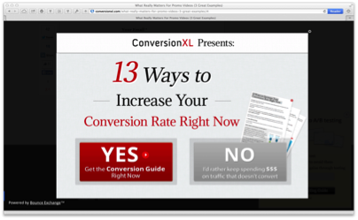
Kyle Geiste, Experience Designer at HubSpot Academy, shares our frustration: “The thing [I hate is] when you go to a webpage and it throws a modal at you … and your choices are “I WANT A MILLION DOLLARS” or “I HATE MONEY.”” Kyle continues: “The pop up is bad enough. The weird mind game they try to play is just wrong… insulting your user’s intelligence [by expecting them to click where you want] is never a good idea — people are much smarter than that.”
We couldn’t have said it better ourselves, Kyle.
5. Splash pages
“I love splash pages and flash intros that force me to read tangentially related content before I get to the page I want!”
…Said no one, ever.
While splash pages can be a great way for a website to force you to look at something or collect your email address, they’re pretty terrible for the users (aka your potential visits, leads, and customers) themselves. Don’t even get us started popups or splash pages that exist solely to display a third-party advertisement or to solicit for Facebook likes and Twitter followers.
6. Using Flash
Ok, maybe Flash isn’t entirely going the way of the dinosaurs, but the shift many public and private organizations are making towards using “open” platforms means that platforms like Flash, which aren’t compatible with mobile devices, will likely continue to decrease in popularity.
Not only is Flash content all but ignored by Google, creating Flash content can be time consuming - and have we mentioned it won’t work on mobile? With more than 1.2 billion people accessing the web from mobile devices, creating a website – be it an intro video, page element, or otherwise – they can’t access is worth mentioning again (and again, and again).
7. Image sliders
Image sliders, also known as image carousels, are on their way out as a website design trend – and for good reason.
Sliders, or carousels, tend to get ignored because people assume they are ads, they can go too fast or too slow for people, can sometimes distract from content, and most importantly can actually decrease conversion rates instead of increasing them.
If you're not tied to the idea of an image slider, there are a few alternatives to consider. For example:
- Show a single static message or offer in text, accompanied by static image(s).
- Show a single static call-to-action alongside some text, possibly accompanied by a static image.
- Show a main message, offer, or CTA where the slider is, then show secondary messages, offers, or CTAs in static featured areas below it.
Still thinking of using a slider? Here’s some more food for thought.
8. Showing off
The concept of “if it’s not broken, don’t fix it” can be applied to many things – from home renovations, to cooking, to web design. Kyle Geiste of HubSpot agrees: “Honestly, the biggest problem is people designing to show off their skills rather than focusing on the basics. If a user understands that X symbol does Y thing in 99% of interfaces, then don’t try to reinvent the wheel. It works. It’s proven to work.”
What are your biggest pet peeves when it comes to website design trends? Let us know by tweeting us at @smartbugmedia.
Special thanks to Kyle Geiste and Amanda Singleton for their insights in this article.

Refine your inbound marketing efforts with:
The Ultimate Guide to Inbound Marketing Personas


Other Insights You Might Like