
January 31, 2018
Pricing pages are important to the success of many customer-facing businesses, but for a software-as-a-service (SaaS) company, whose product may only be offered digitally, the pricing page is hypercritical. To borrow from the title of everyone’s favorite gameshow (admit it, you love Plinko!), the pricing page must be right.

Pricing pages are one of the few pages on a SaaS website that give the visitor information straight up. Customers want to know quickly what the product can do for them and how it will help based on particular price points. If a pricing page feels like a make-or-break element of a SaaS business’s website, well, in many ways it is …
Impressing the Customer
The way pricing pages are structured also affects the willingness of a website visitor to become a subscriber. It’s all about educating the user relatively quickly by aligning your products and services with an effective messaging design.
There’s no right or wrong way to do pricing pages, but they should be optimized continually as your business grows, as well as tested to ensure they are intuitive, communicate the right message, and convert well.
Simplicity is best, and a good recipe for a pricing page includes:
- An effective headline: This sets the tone and voice and compels the visitor to learn more.
- A list of benefits and features: Make sure this list is easy to skim and digest. You also might include comparison tables, add ons, FAQs, trustworthy social proof (e.g., testimonials), and easy access to a quick live chat if visitors have questions. Your messaging must speak to target buyers and personas.
- Clear and easy pathways to brightly colored CTAs: This helps initiate conversions.
Great Examples of Great Pricing Pages
Here are some examples that highlight SaaS pricing page best practices:
Freshdesk
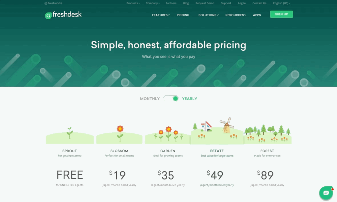
- The headline is simple and sets the tone and emotion for the rest of the page.
- This example also highlights the best plan option by adding a fun animated illustration to the package.
- Directing visitors to a particular plan by highlighting the most profitable option as “most popular” is a common practice. Furthermore, adding design emphasis by placing bright colors around the popular section helps guide visitors in choosing a selection. Another tip (which isn’t present here) is to anchor the most expensive option first—visitors read left to right and are conditioned to see the lowest-priced package first.
- Another best practice seen here is a live chat feature that provides instant user feedback.
InVision
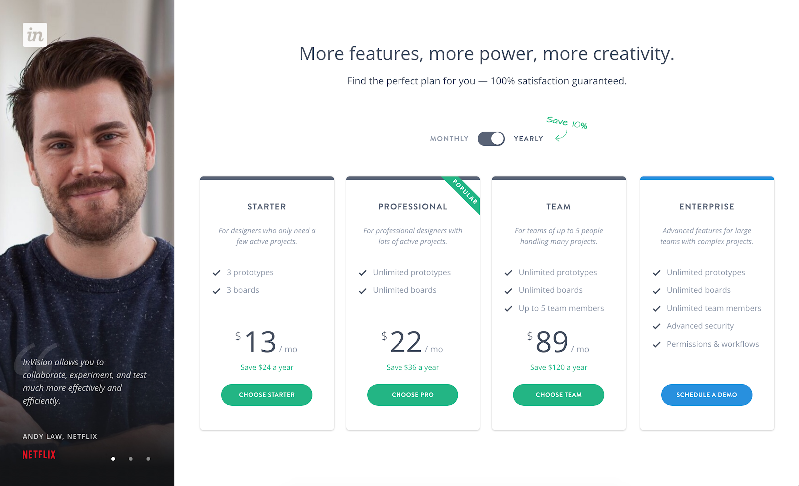
- The amount of copy on this pricing page is reduced, which turns the focus on a small chunk of text above or near the fold so visitors can zero in on the actual pricing plans.
- The page portrays trustworthiness by showcasing testimonials as social proof, along with popular company logos.
- Another nice feature is the monthly/annual plans toggle that displays the amount of savings per toggle.
- Each plan targets a particular persona and labels each CTA according to that target, rather than just saying “Buy Now.”
ChartMogul
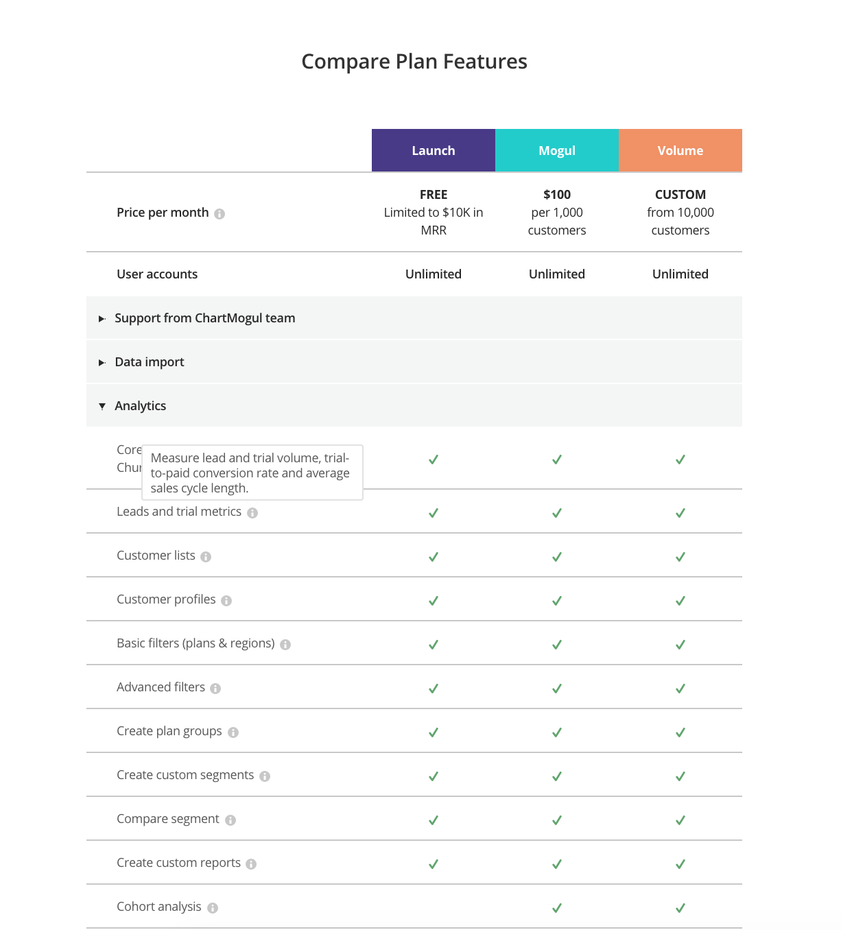
- Simple is always the key, but if a laundry list of features must be showcased, include a comparison table with short bullets that is easy for the reader to digest. ChartMogul uses expand/collapse menus to showcase several sections of features, which helps prevent endless scrolling and lets users expand the sections that most interest them.
- ChartMogul also incorporates additional information in tooltips if visitors want to learn more about a particular feature.
Onfleet
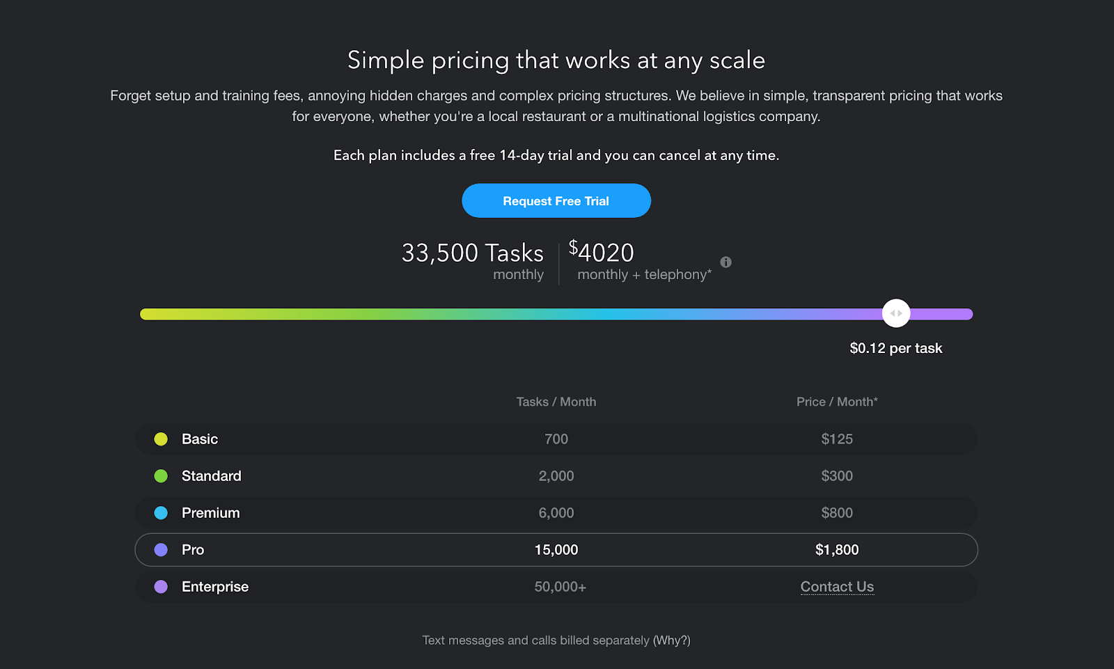
- Adding interactivity, such as a price slider to see different scale options, gives visitors something to play with, which ultimately makes them stay on the page longer. Onfleet’s slider also selects the pricing plan based on how far the visitor drags the slide.
- Both the CTA and the pricing slider are above the fold. Incorporating CTAs above the fold makes them stand out, thus making it easier for users to convert.
- Colors are bright and contrast well with the simple dark background.
- Any type of unlimited/enterprise plan should include a “Contact Us for Pricing” CTA rather than list a static, large number that could scare off potential customers.
Mailchimp
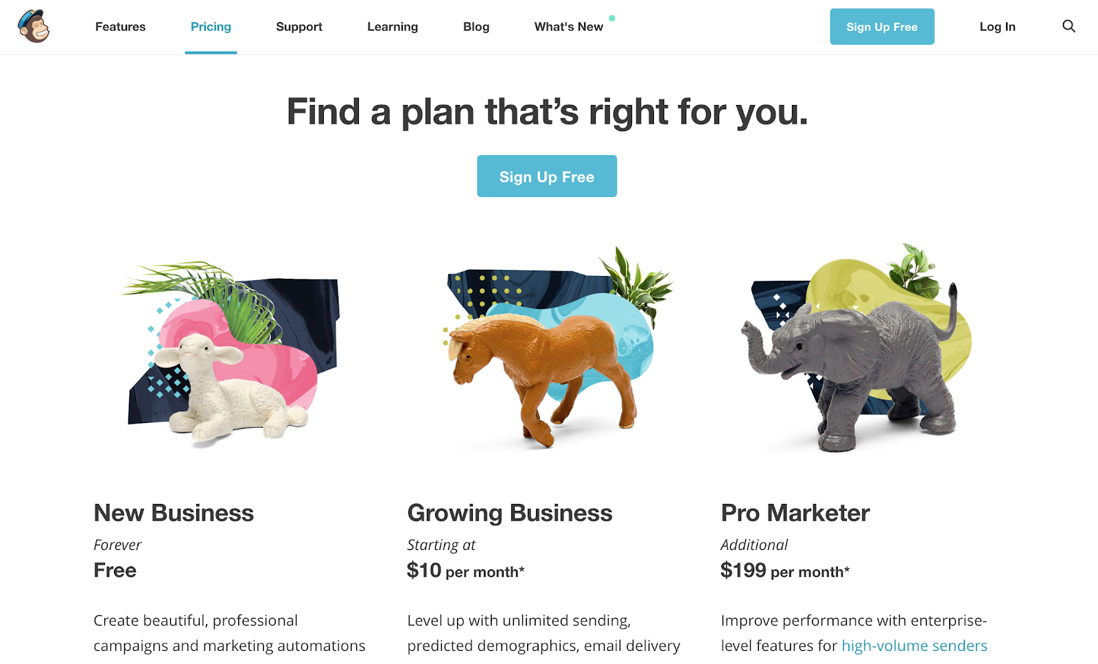
- Besides labeling plans by persona, Mailchimp also uses playful imagery for each plan.
- Sometimes, having too many choices can overcomplicate things, thus increasing bounce rates and/or giving visitors analysis paralysis, in which too many decisions prevent someone from taking an action. Fewer is better—three is typically the standard number of plans that should be showcased on pricing pages.
- Adding free plans or a free trial is usually determined by several factors, including the sales funnel, target customers, the level of difficulty learning how to use the product, and whether the product can sell itself. Sometimes, “Request a Demo” might be best to get a salesperson involved with customers to properly set up, answer any questions, and talk more about features of the product that the website couldn’t showcase.
Let us know your favorite SaaS pricing pages on Twitter via @smartbugmedia.


Learn about web optimization with:
The Keys to Website UX and Usability


Other Insights You Might Like