How Good Design Increases Lead Conversions
September 21, 2017

When it comes to marketing, design isn’t just about making things look pretty. Don’t get us wrong—that’s definitely an important piece. But more often than not, the true measure of what makes a campaign, design, or any piece of marketing material successful boils down to one question: Did it convert? You can have an amazing-looking website, but if pages aren’t converting visitors to leads, your site isn’t performing its primary function.
Every designer learns the fundamentals of good design in school. The process of understanding the Z-Layout, utilizing grid systems, and applying concepts like color theory builds the foundation for creating design that effectively communicates with a given audience. Designing with lead conversion in mind builds on those fundamentals and takes it further by enticing users to take a specific action through purposeful visual cues.
Unbounce co-founder and Creative Director Oli Gardner created a system of seven design principles called Conversion-Centered Design. In it, he outlines how to use attention, context, clarity, congruence, credibility, closing, and continuance to optimize landing pages for maximum conversions. Starting with stripping out unnecessary links that draw users away from your primary CTA, Gardner’s framework is full of tips for increasing lead conversions.
Below is our own list of design considerations to keep in mind to make your website more effective at converting visitors into leads.
Visual weight and direction
The classic Z-Layout has its place, but with testing methods like eye tracking, studies are continually discovering that the human eye actually bounces dramatically around a web page and reads web content in an F-shaped pattern. When there are competing elements on a page, the eye tends to land on what’s most visually dominant. Basically, we look at the big, heavy stuff the most and scan text from left to right.
We also love looking at people. We can’t help ourselves. There’s something about establishing a connection with a person, even if it’s just a static image on a website, that appeals to our social animal instincts—and babies: Forget about it.
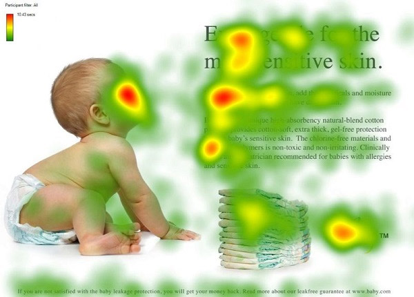
When a diaper company performed an eye tracking test with two versions of a page, it found that the adorable baby’s face garnered the most attention. No huge surprise there.

But when the image was swapped for one of the baby looking at the copy, users not only looked at the baby’s face but became more focused on the copy. Notice the stronger F-shaped pattern from the headline down to the body copy.

Placement matters—but not where you think
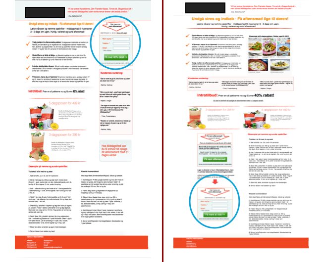
There have been numerous articles over the years that prove people scroll down web pages. The urge to put all the most important content (read: CTAs) at the top of a page to ensure lead conversions isn’t as necessary as you may think. As the Nielsen Norman Group wrote, “Users do scroll, but only if what’s above the fold is promising enough.”
An article in Kissmetrics notes three separate tests whose findings support that claim. In each test, CTAs that were moved from the top of the page lower down—and even to the bottom of the page—resulted in the same or increased conversions.

To increase conversions, you must provide users enough information to be able to make an informed decision. Grouping CTAs at the top of the page doesn’t give users the context they need to understand what your company does and how it provides value. Placing CTAs next to the information that users find most relevant is more effective at converting leads.
Avoid information overload
While users need information to convert, it’s important to be cognizant that too much information can be a bad thing. Three psychological concepts to keep in mind when determining how to lay out a web page are:
- Information Overload: Bertram Gross coined this term in his 1964 book The Managing of Organizations, defining it as follows:
“Information overload occurs when the amount of input to a system exceeds its processing capacity. Decision makers have fairly limited cognitive processing capacity. Consequently, when information overload occurs, it is likely that a reduction in decision quality will occur.”
2. Decision Fatigue: When faced with too many options to choose from, the influx of choices could lead some users to make an uninformed decision. This may result in a conversion but not necessarily the marketing qualified lead you want.
3. Decision Avoidance and Analysis Paralysis: Conversely, some users may make no decision at all when faced with too much information.
You want to give your users the information they need when they need it. So if your website is inundated with copy, ask yourself: Is it all necessary? Would a user understand your product well enough to convert if you cut the copy in half?
Besides ensuring you have the right amount of copy, utilize design elements like white space to give your content breathing room. This will allow users to focus and absorb what’s most important on your site.
Colors count…maybe
Though Goethe’s Theory of Colors is still very much in use today, it was published 207 years ago. Some things have changed since then. A classic web design conundrum is which button performs better: red or green?
When HubSpot tested this, the red button outperformed the green by 21 percent. ConversionXL compared four case studies that performed similar tests, including HubSpot’s, and concluded that though the red button won in three out of four, other factors were at play. There is no single color that leads to more conversions.

Test, test, then test some more
All of these methods have been tested and proven effective at converting users in their respective use cases in some manner. But like the button color tests, that doesn’t necessarily mean they are right for your website. Use what makes the most sense for your needs and start with A/B testing to see what has an impact on lead conversions.
But while A/B tests are important, to fully optimize for conversion, you need to dive deeper into other testing methodologies. This article from Moz outlines common mistakes people make when testing for conversion rate optimization. The author argues, “The primary goal of CRO is to find the truth.”
Remember—there is no 100 percent right answer. Test a number of methods to find what produces the best results for your website. No one has all the answers, but these design tips will start you on the right path to increasing your lead conversions.

About the author
Danielle Riley was formerly the Creative Director at SmartBug Media. She has over 10 years of experience designing for business large and small. With a background in journalism, she approaches design from a strategic and research-oriented perspective. Good design is clean, useful and serves a purpose. Read more articles by Danielle Riley.


