
July 22, 2019
Providing a good user experience for your website visitors is an essential step to ensure that you are able to capture leads by having users fill out your forms. By reducing the difficulty of filling out the form, providing a clear layout, ensuring optimal placement, and A/B testing these attributes, you can test your conversions and ultimately improve the submission rates for the forms on your website.
Reducing Attrition
As Sun Tzu, the general from ancient China, once said, “The supreme art of war is to subdue the enemy without fighting.” Although creating an enticing landing page or form may not seem like a battle, the layout and display nuances that deter your users from filling out a form wage a war of attrition against form submissions! These items act as the enemy of submissions that we must defeat. Therefore, one of your main goals should be to make the user experience for submitting forms as painless and clear of a process as possible in order to increase your conversion rate.
One way to reduce attrition is to make the form as approachable as possible. If people look at your form and see 30 fields they must fill out, many might consider that too much work for what they are receiving in return. The first step you should take is to ensure that you are not using an excessive amount of fields and to see if you can reduce the field quantity while still capturing the necessary data from the user.
For something such as a content offer, you must consider the cost-benefit analysis for the user. Unless they feel that the information they’re receiving holds high value, people are hesitant to give out their personal information.
By creating a trade-off that is worthy of a form submission, you are taking the first step toward providing real value to your visitors. Of course, you should try to qualify all leads before sending them to a form page by understanding inbound marketing personas so that you can ensure that you are directing your visitors to the correct content or offer for them to consume.

Multi-Step & Pre-filled Form Fields
One way to reduce the overload of form fields is to create a multi-step form that breaks the fields into logical steps.
It is recommended that you put the simpler and less time-consuming form fields in the first step so that users don’t take a first glance and become overwhelmed. Once they are in a few steps, more difficult questions are appropriate because the user will feel that they might as well finish because they have committed up to that point.
Multi-step forms may require custom development or leverage of a CMS or CMS plugin that allows their creation of these advanced forms.
In the example below from Sprout Social, you can see how the account creation steps are broken into three obvious steps. This is a much more digestible approach for users, who only see five form fields at first, rather than more than 10.
The fields are also common fields, such as name and email, so many users’ data will autofill based on their browser settings, making completing the form a quick and easy process.
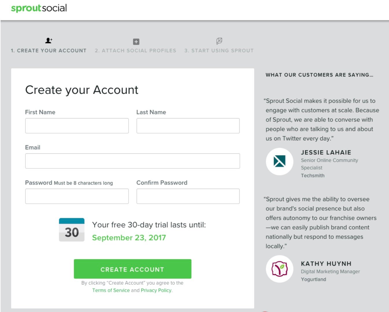
There are various ways to show the steps, including listing them in order as seen in the image above, but another great way is to have a developer add a progress bar. This gives users a more realistic level of effort of how many steps there are as they are going through the form filling process.
You’ll also want to make sure that you give as clear as possible direction so that the user is not confused about what content should go in each field. For example, make the placeholder text give realistic examples of what you are expecting as a response.
When possible try to use autofill fields, which prevent people from abandoning the submission due to not knowing a zip code for instance.
Demonstrating Authority with Design
Not only should your forms be easy for users to fill out, but users should also trust that their information is safe when they submit it to your website.
Make sure that your site has SSL enabled, which is confirmed by seeing a padlock and “https” in your URL browser. Beyond actual security, modern designs can play a psychological role in confirming that your site is trustworthy.
Websites and forms give users an overall impression of your company.
If the first representation of a company is one that seems antiquated, an impression may be left with the visitor that your company’s services and offerings are also not up to modern standards. Modern websites have long rid themselves of the basic form stylings set by web browsers.
Let’s take a look at the two forms below. People have been conditioned to the design aesthetic of the form on the left, with a slick and modern feel that many tech companies such as Apple and Google have been moving toward for years.
The clean look with sans serif fonts has dominated the web for the better part of a decade and users have become accustomed to this modern aesthetic.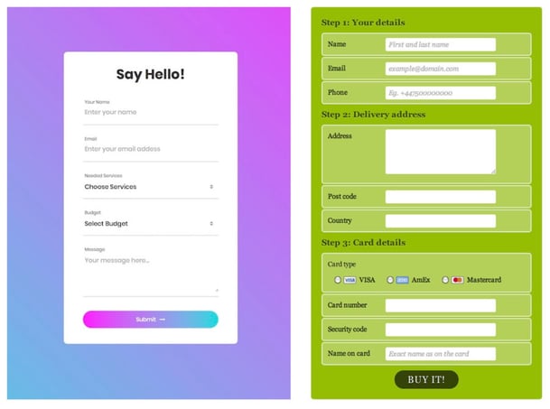
Placement & Testing
If you have the means—either through a user-friendly CMS or access to a developer—I highly recommend that you perform A/B testing on all of your forms so that you can try various placements and ways of showcasing your forms. Once you are able to gather enough data, you can make sure that you are getting the highest conversion rate possible. Placement can play a huge role in your conversation rate, so it’s important to test different areas of the page.
Here at SmartBug Media™, we have seen some personal success using what we call sticky sidebar forms. In this example, if you are not on mobile, you can see that the form follows you down the page as you continue to scroll. This has the benefit of being able to give users the information they need to feel comfortable enough to hand over the contact information.
It is often recommended to keep the form “above the fold,” meaning within plain view without having to scroll down. It’s important to continuously try different layouts, depending on how much content you have, and to A/B test throughout. Keep in mind that you’ll want to make sure you are also A/B testing your content to ensure that it’s engaging and well thought out.
You may find that specific layouts work well for some users and not for others, which is why you should be tracking all conversions. If you are using a marketing automation platform like HubSpot, A/B testing is a built-in feature that we always help our clients take advantage of in order to gather great data and make informed decisions.
Plan, design, build, and launch your website successfully with:
Mastering The Art of Website Redesigns


Other Insights You Might Like