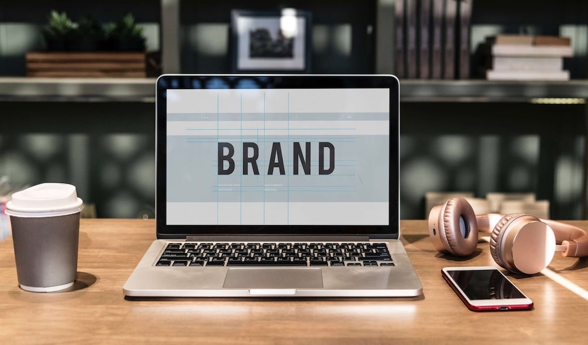
As a designer, I've always had a slight obsession with downloading new fonts and implementing them in my designs. They are just as important as any graphic asset and can make or break a layout. They provide visual hierarchy for copy, make content easy to scan, add character and emotion to a company’s brand, and help you better align with your personas. Plus, fonts are a fun design trend to follow.
Fonts can portray different types of messages, evoke emotions, and give a professional vibe to your website and marketing collateral. These are just some of the ways you can make your website successful. One of the things I look for in a font is a variety of weights. These can add visual hierarchy and style to your content.
Premium Fonts
There are endless options for beautiful premium fonts on the web. For companies that can afford them, they’re great options to add uniqueness to the company brand. Before downloading a premium font, check the font founder’s website to see how the font is permitted to be used based on the license (i.e., personal or commercial or both).
Free Fonts
Personally, I like using Google Fonts because it’s free and easy to download the desktop and web versions. If one agency designs a brand style guideline package, it’s easy to hand that style guide off to another agency or internal person, as opposed to purchasing a premium or subscription font. Free fonts are great to use when you are experimenting with different design trends and font styles to find what works best for your brand.
Below, I’ve chosen a versatile mixture of sans serif, serif, and display fonts that work well with a variety of industries and can be applied to websites, making them legible on all devices. I’ve also included options for font pairings to help you create unique combinations that follow current design trends. All of these fonts are available for free through Google Fonts for personal or commercial use.
Poppins is geometric in style, clean, and includes 18 different font weights, from thin to black. Thanks to this range of font styles and the font’s open feel (as you can see in the loops of the “p” and “o” above), this font is great for both headlines and paragraph copy to improve readability and style.
Good to use if your style is:
- Playful
- Modern
- Natural
- Professional
Lora is a serif font with roots in calligraphy. This serif font is a fun play on the more traditional Times New Roman. The four font weights include regular, regular italic, bold, and bold italic for a simple selection to create your website’s look and feel. This font works well on headlines and paragraph copy, and is paired well with sans serif fonts such as Lato.
Good to use if your style is:
- Sophisticated
- Academic
- Historical
With 14 different font weights, Nunito is a well-balanced sans serif font with rounded edges. Its four font weights include regular, regular italic, bold, and bold italic. This font works well anywhere on your website, from headlines to paragraph copy, and pairs well with sans serif fonts such as Roboto.
Good to use if your style is:
- Playful
- Youthful
- Funky
- Modern
Inspired by the geometric fonts of the 1920s, Josefin Sans includes 10 font weights and styles to choose from and works great in headlines or large text with a creative flare. The kerning, or space between letters, is wider than other fonts to make up for the more narrow letters.
Good to use if your style is:
Arvo is a geometric slab serif font that includes four basic weights (regular, regular italic, bold, and bold italic). According to Google Fonts, Arvo is an Estonian name that is not widely used for boys today. In the Finnish language, Arvo means "number, value, worth." Arvo is a great font to use when you want to call out certain letters, such as in logos or headlines, with its stylized serifs.
Good to use if your style is:
Hind Madurai is a monolinear sans serif font that includes five weights (light, regular, medium, semi-bold, and bold). It’s a good typeface for UI design and can be used on any size content from headlines to small text because it is very readable. Hind Madurai also comes in a variety of other glyphs you can use for multilingual websites to help maintain brand consistency.
Good to use if your style is:
- Modern
- Professional
- Conservative
Catamaran is a clean and versatile font with nine weights ranging from thin to black. With this range and the polished yet casual feel, it is a great choice if you want to make your professional brand feel more relaxed and approachable.
Good to use if your style is:
- Professional
- Playful
- Techy
Vollkorn’s antique character gives this serif a unique vibe and comes in everything from light to heavy weights. The variety offered by the creators of Vollkorn helps you create just the right branding to stay current with the latest design trends. Not only would it work in headlines with a chunkier, more old-fashioned look, but it also works as a display face when using a lighter, more modern take on the font style.
Good to use if your style is:
- Vintage
- Playful
- Antiquated
If you want to stray away from the typical monolinear typefaces out there, meaning there isn’t a weight variation on the letters’ vertical and horizontal strokes, Pragati Narrow’s thin and vertical style gives off a modern and unique vibe. It is, by far, the most condensed font style of my favorites and pairs well with other, more open sans serif fonts, such as Roboto and Open Sans, to create that more modern style that is very popular in design trends right now.
Good to use if your style is:
- Mechanical
- Techy
- Eco-friendly
Vidaloka is a display typeface with only one weight. It works well as a headline or short chunk of content, but it can be harder to read in smaller font sizes. It pairs well with sans serif fonts such as Roboto and Lato.
Good to use if your style is:
I hope I’ve given you some ideas on how can you stand out, stay on brand, and stay current. It’s important to test your brand messaging in a variety of fonts when you are considering a rebrand, new creative, or website design. Even the best headline can fall flat if your font isn’t working to convey your message.
That being said, don’t fall prey to FOMO (the fear of missing out) on the new hot design trends. Brand consistency is also important for creating a lasting impression on your audience.