Burroughs
Developing a Branded, Easy-to-Use Site for Payments Tech Firm


Background
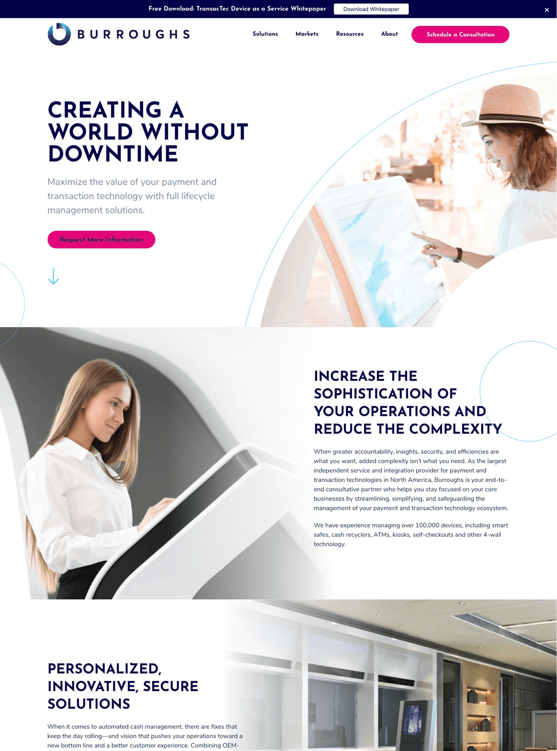
Burroughs is North America’s largest independent service and integration provider for payment and transaction technologies. They manage more than 100,000 devices, including smart safes, ATMs, and self-checkout technology. After updating their messaging platform, value proposition, and vision, the Burroughs team wanted to visually rebrand the organization to better represent who they are and where they are headed. The team also had some great content ready to launch—they needed a better launchpad. SmartBug’s team created an easy-to-use website that will help them grow their content strategy while also giving them a branding experience that better matched their new vision.
Careful Logo Design
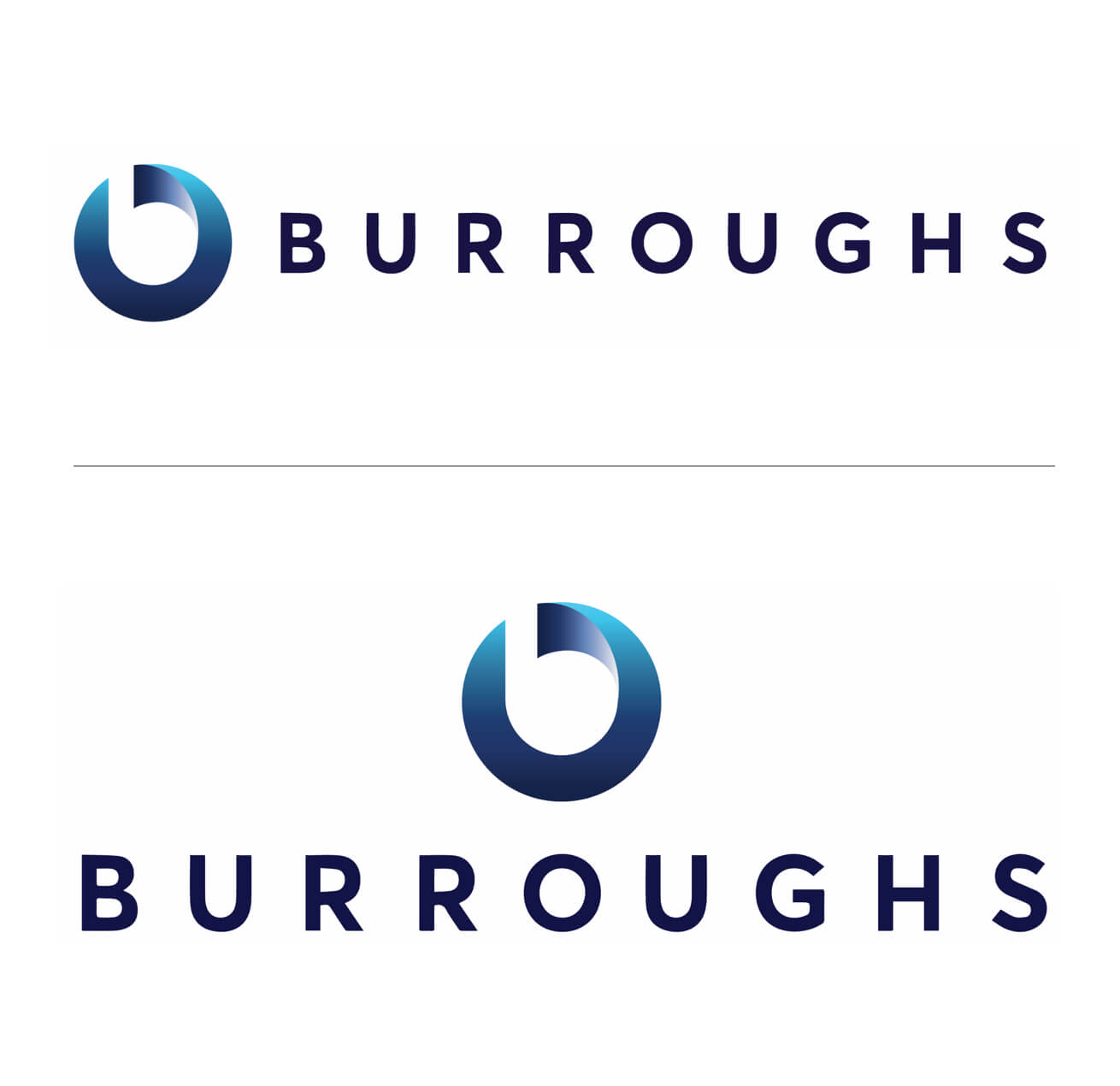
Branding started with creating a new logo—a monumental task for any business. Playing off the “b” in their name and the concept of the circle of lifecycle management, our creative team worked closely with the client on each logo iteration. In the end, we created a clean-looking, brand-anchoring logo that reflected Burroughs’ accomplished place in their industry.
Modern New Look and Feel
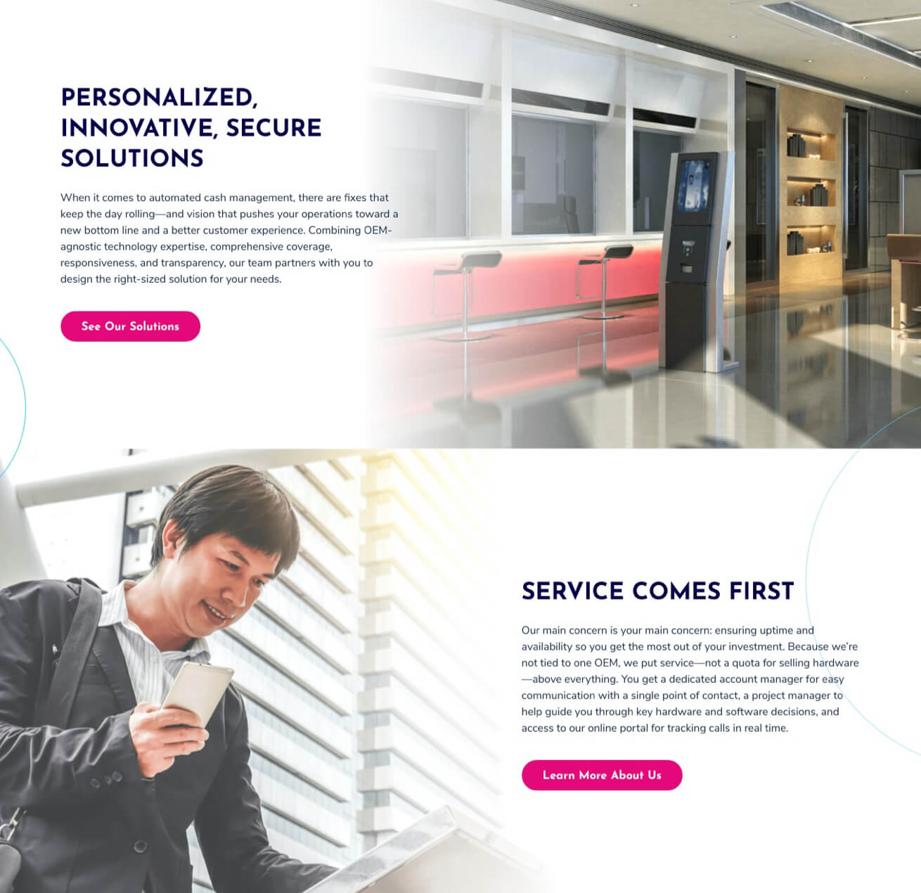
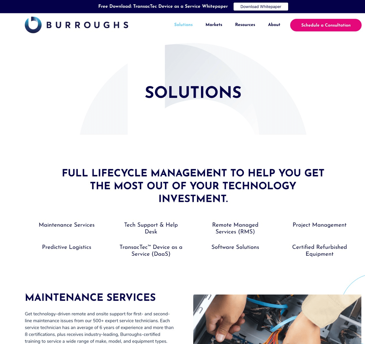
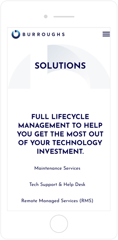
Burroughs wanted to ensure their new website reflected the future of their industry. This meant that our creative team thoughtfully chose images that would align with our forward-thinking client’s brand. Our team also used white space with brief pops of color and avoided dark backgrounds. The result is a clean, branded, easy-to-use website.

Easy-to-Manage Pages
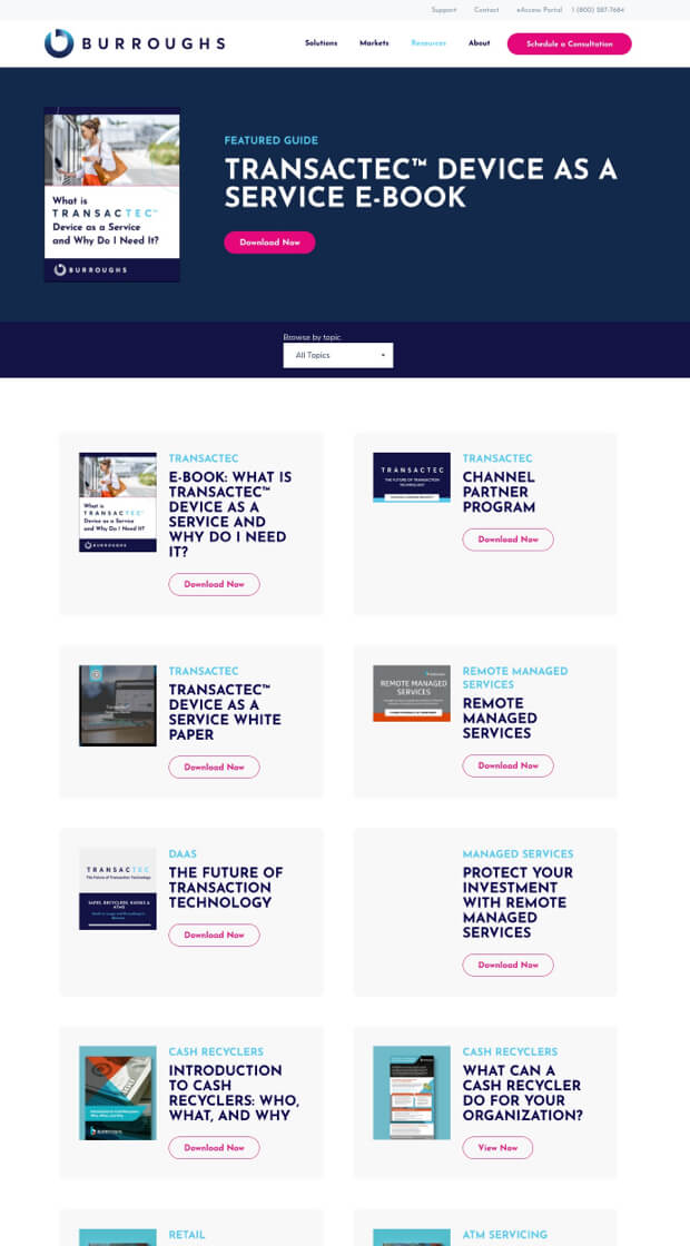
To ensure the Burroughs team could easily update and change their website, our development team rebuilt page templates in HubSpot’s CMS, including the blog and resource center. This made it easy for our client to edit and manage their site, giving them the ideal launchpad for all of their current and future content.


