
February 20, 2020
Picture this: It’s Saturday morning. You have a fresh cup of coffee in your hand. You sit down in your favorite spot and open up your laptop. What do you think about when you arrive at that first website? Is it finding the main feature story of the day? Maybe you just like to scroll down and see what’s new? One thing I would wager you’re not thinking about is the site’s navigation.
Website navigation is something we all take for granted, especially if it’s executed well. It’s only when we can’t find the pages or the information we are looking for that we notice it. This should tell you just how important navigation is for any website—and why neglecting navigability will quickly drive users away from your website and its content.
Keep reading to learn how you can improve your website’s navigation.
Tips to Make Your Navigation Intuitive
The first thing you want to do is make things easy for your users. Don’t overthink things, because this can take you down a long and complicated road that can be hard to come back from. Here are a few tips to help you along the way:
1. Be mindful of clicks—but there's no limit!
There’s an old (unofficial) rule of thumb which states that users will click up to three times on a website to find what they are looking for before abandoning and moving on to the next.
The problem with this idea is that it's too general. It doesn’t speak to the variety of users that could be visiting your site or the array of devices they may be using. You want your users to be able to find what they are looking for as quickly as possible, but counting the clicks will not necessarily help you achieve this.
Instead, create a clear journey for your user to take. Give them options. If e-books and white papers are popular resources, put a resource center link in your main navigation and feature those resources somewhere on the homepage.

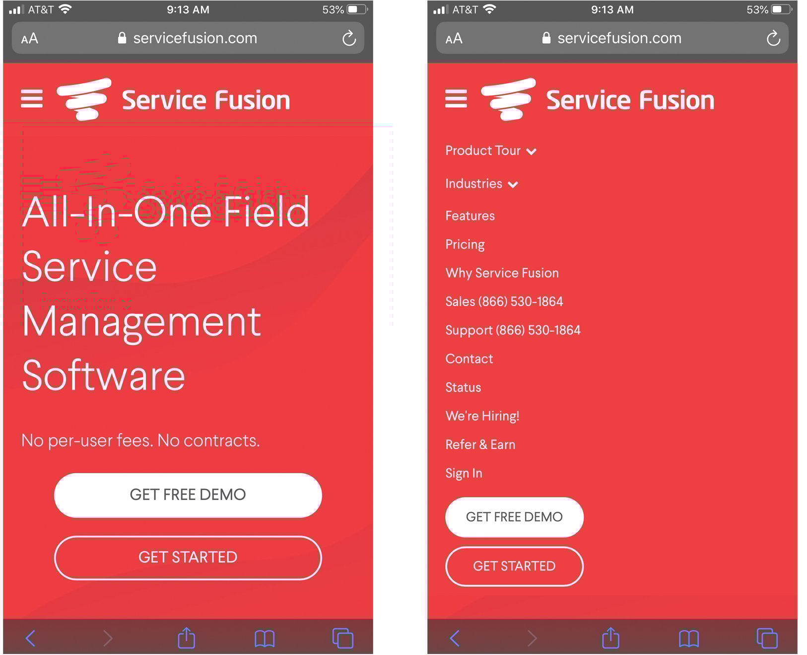
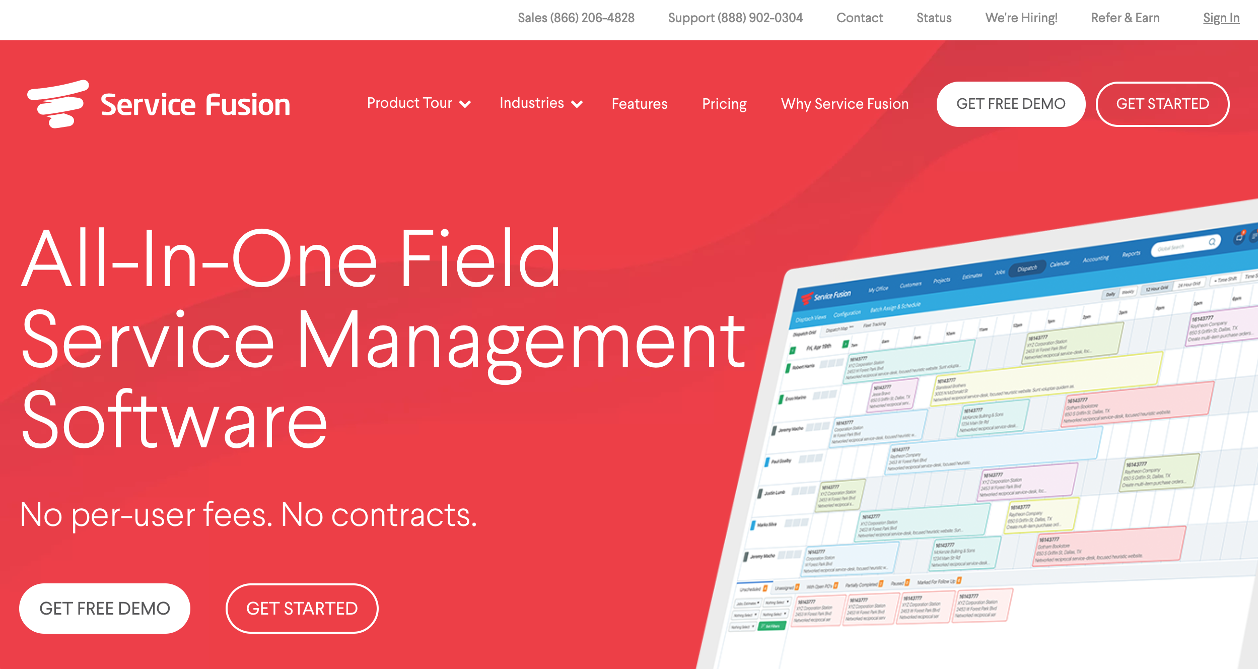
2. Always consider mobile, but don’t forget (or neglect) desktop.
The “mobile first” mantra may be good for some, but it's dangerously simplistic. A better approach is to consider multi-platform functionality when thinking about navigability on your website. This means ensuring that your navigation is usable across all platforms.
In terms of the journey that your users take, this should not differ all that much. Just keep in mind the different interactions that are needed for each platform. For example, on mobile, your navigation will most likely convert to a hamburger menu. In this case, just make sure that your CTAs are still easy to find and any important information is not hidden too deep.
3. Think of sticky navigation as your friend.
Utilizing sticky navigation makes your main navigation elements—along with important CTAs and contact information—always visible to the user. This is helpful for allowing them to scroll freely on each page and it also assists user retention on your website.
This brings us back to my earlier point: The first thing you want to do is make things easy for your users. Sticky nav does exactly this.
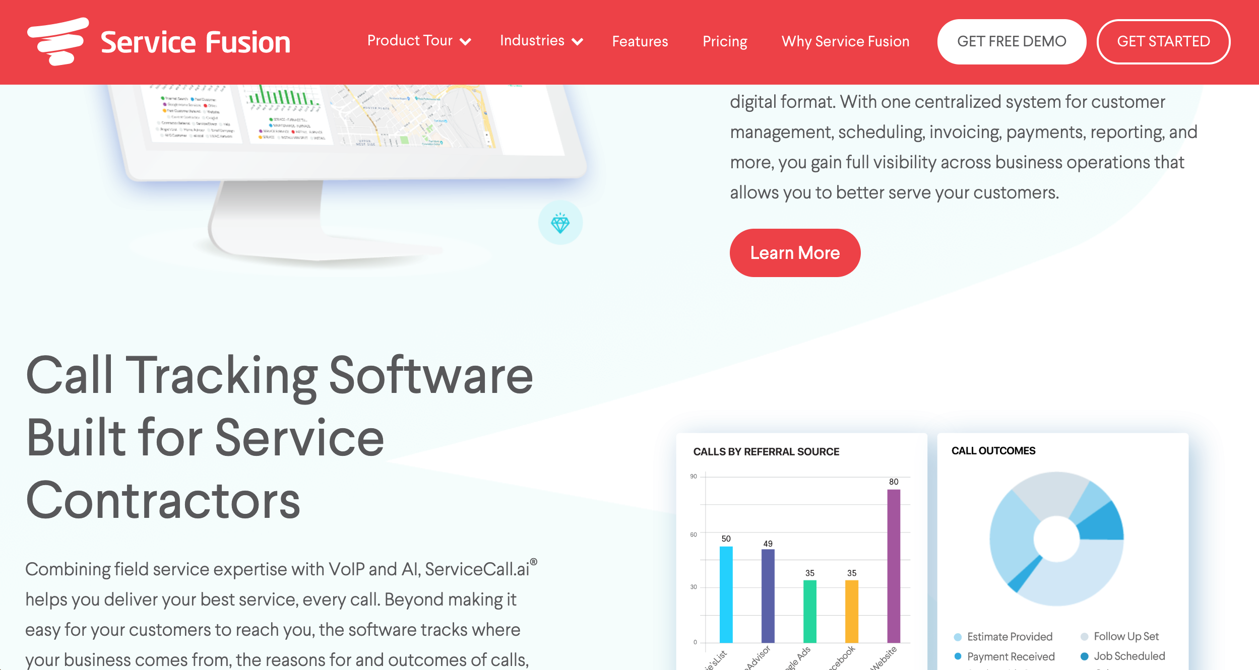
It's important not to over clutter your sticky nav. Giving too many options is just as bad as giving too few. Keep in mind the limited real estate and try to stick to one CTA and a phone number in the sticky nav (along with the main navigation items, of course). Eyebrow bars are also helpful to house extra information such as login links, but consider hiding these on mobile and moving those elements to the hamburger. You don’t want a large vertical nav bar covering up your content.
As some next steps, revisit your website’s navigation and dive into its functionality. Are users finding what they’re looking for? If not, explore ways you can make it easier for them. If you’re not already doing so, consider utilizing a sticky nav to keep that important information prominent and always available to the user.
I would also highly recommend the book Don't Make Me Think by Steve Krug for a deep dive into usability on the web.

Learn the mistakes to look out for during each stage of the design process with:
31 Website Design Crimes to Avoid at All Costs


Other Insights You Might Like

-4.png?width=800&length=800&name=Untitled%20design%20(1)-4.png)