


April 19, 2018
During my time as an in-house marketer, I was asked, not infrequently, for KPIs and reporting information. Since I was the lone marketer in these situations, I was the only person who knew how to get that data, which led to frustration on both sides. Fast forward to agency life, and I’m happy to say that I’ve finally found a tool to solve that problem. Enter Databox, a dashboard tool that provides visualizations of your own goals and KPIs. If you haven’t taken it for a spin yet, you’re missing out on some intriguing reporting opportunities.
As a long-time HubSpot user, I’ve seen the reporting tools in HubSpot come a long, long way. The latest update, focusing on analytics tools, provides much more detail about traffic and performance, but there are still things that are on my wishlist for HubSpot—and some of those things, Databox will do for you, right out of the box. Here are some of my favorite Databox features for getting more out of HubSpot.
Percent Change vs. Previous Period
HubSpot’s data visualizations are great for seeing long-term trends and diving down into individual performance for a certain time period. For example, I can easily choose a specific blog post and see a long-term traffic trend, broken out by sources. This report is incredibly valuable for seeing how traffic to a blog has changed over time and if that blog ranking for high-volume search terms:
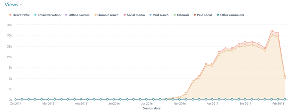
Where this report falls short is in its limited ability to show me how much a blog post’s traffic has grown over the last month. This type of reporting is important, because it gives me, as a marketer, insight into the movers and shakers of your blog posts—the posts that are contributing the most to traffic growth and that warrant a deeper dive to uncover why.

Here’s what the reporting looks like in Databox:
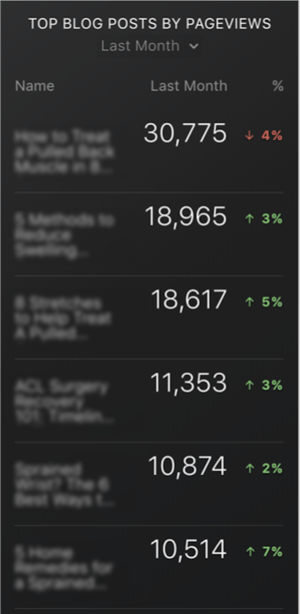
Before Databox, the above analysis would have been a tremendously manual process, requiring me to pull monthly data for an individual blog post, do a little math, then repeat, repeat, repeat for each post. With Databox, I’m able to collect that information at a glance and focus on why, not what.
In this example, I’ve focused on blog performance as an example of percentage change, but I should note that nearly every data block gives you the option to compare a time period to the previous.
Goal Tracking
While HubSpot will let you track some of your goals, list visits, leads, and customers, HubSpot’s goal tracking features are fairly limited. In fact, I’ve found that most organizations have more business-centric goals in mind for marketing. Key Performance Indicators (KPIs) are more often focused on volumes of sales opportunities, sales qualified leads, or closed business. While you can create reports and lists in HubSpot to show these things, visualizing how much of your goal you have reached is much more difficult. In this case, Databox provides additional opportunities for goal tracking. My favorite goal visualization is the gauge:
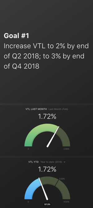
Here, you’ll see a two-part goal statement focused on improving a website’s visitor to lead (VTL) rate with two associated goals: a 2 percent VTL by the middle of 2018 and a 3 percent VTL by the end of 2018. In the top gauge, last month’s VTL is displayed in a range of up to 2.5 percent. You’ll notice that things are moving in the right direction!
Now, to track the annual perspective, you’ll also see a bottom gauge with a goal rate up to 3.5 percent—this gauge shows just how far this website needs to come to meet the goal (although it’s over halfway there and has shown great progress in the last few months—definitely a win).
With such streamlined views into your marketing goals, it becomes much easier to dig into other data. You’re more informed when you start looking at performance, instead of trying to look at every possible metric every three days.
Spend More Time Asking Why
Traditionally, much of marketing reporting focuses on telling what happened. Gathering enough data to explain the “what” often means we don’t have a lot of time to find “why” and determine what to do next, either to recover from declining performance or replicate great performance. With a dashboarding tool like Databox, establishing your “what” is incredibly simple, which makes finding out “why” easier than ever.
Photo by Matthew Henry from Burst


Identify your marketing goals, along with the tools to measure KPIs and report success along the way with:
Goal Setting and Reporting for Long-Term Success


Other Insights You Might Like
-2.png?width=800&length=800&name=Blog%20header%20image%20(1)-2.png)