July 27, 2017
Besides defining your brand, color grabs attention, conveys the right emotions, and also helps illustrate the hierarchy of page elements in your design. It’s a big influence in user engagement.
Also important for influencing engagement are a good user experience and well-written content (especially specific CTA wording). However, if you include these elements in your web design but still showcase a light-colored CTA on top of a white background, your conversion opportunity will go completely unnoticed.
You need users to easily find your website’s navigation, follow the page’s story, read important headlines (or skim certain areas of content), and click on any necessary actions that get them to their next step in the conversion process. Something as simple as the psychology of color can influence all these actions.
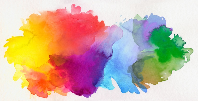
The psychology of color helps you predict how your customers will respond to the elements on your web page. Certain colors trigger certain emotions in people. For example, blue conveys trust and dependability. Green conveys growth and health. Orange conveys friendliness and confidence. Gray creates balance and is neutral. Understanding your target audience will help you determine the right colors. Is your business targeted to a specific gender? Do you want to evoke a classy vibe or a fun and youthful feel? Is your product or service high-end or affordable? Colors can bring about the emotion you want to convey for your brand.

Here are some specific ways that color can influence the outcome of your website:
Contrast and Placement
Contrast is a measure of variation between two colors. Colors on the opposite sides of the color wheel provide the greatest level of contrast. By adding contrast between text, background, and buttons, the user’s eye is influenced to move throughout the page; if designed correctly in terms of color contrast, your eye will be led to the important elements on your page. Other factors to consider include whether or not your colors contrast enough for text to be legible and if the CTAs pop out at you as a user.
As for color palettes, thanks to minimalistic trends in modern web design, the emphasis is on simple colors that guide the user's attention to particular elements on the page. A lot of modern designs include white backgrounds with subtle “pops” of color, similar to the new SmartBug website.
Interactions and UI Patterns
Color isn’t there just to be visually pleasing; it can indicate functionality. Color clues indicate how a user should interact with a particular experience.
Certain colors better communicate alert indications and error messages in form fields and other visual elements. Other examples include button states, breadcrumbs, tabs, links, and multi-step indicators.
A/B Testing
A/B testing can take the guesswork out of design to determine which colors work best for your CTAs. Moz did a case study on how color psychology improved its website with a simple change of color. Changing a CTA button from green to yellow resulted in a 187.4% increase in conversions on its website. This showcases how great of an impact a simple color change can make to a website. These small changes are less risky and costly for smaller companies. Experiment with contrasting colors, accent colors, and background combinations to find out which is best.
HubSpot A/B tested a landing page and did a button color test. One would assume green would win out because red indicates warnings or “stop.” Green connotes “natural” and “environment” and is widely used on many websites.

The results showed that red outperformed the green button by 21%. The main takeaway is not to go out and blindly switch CTA buttons without testing.
For CTAs, there is no one color that converts better than the rest, but bright colors are known to get a lot of clicks. According to Kissmetrics, in strict testing environments, red, green, orange, and yellow are the highest-converting colors.
To sum it all up, color is a powerful tool that can vastly improve user engagement. It definitely can take a certain skill set to choose the right colors.
Not sure which colors work well together? There are a ton of great tools online to help you choose the right colors:
- Coolors – This site generates almost endless amounts of modern, elegant color palettes.
- Adobe Color CC – Besides providing random color palettes, you can input search terms to find relevant palettes.
- Colordot by Hailpixel – You can generate custom color palettes by changing colors with your mouse.
- Colors on the Web – Add in a hex number into this color wizard and it will generate complementary color schemes and variations based on your input color.
What other tools do you use for selecting website colors?


What really makes your customers tick? Find out with:
The Psychology of Inbound Marketing