


November 26, 2015

Given the temporal nature of websites and the ability to implement change quickly, web design trends come and go at a quick pace. Whereas five years may not be long enough to recognize a true “trend” in many industries, it is certainly enough when it comes to web design!
Here are five of my favorite design trends that popped up about five years ago and are still going strong:
1) Big headlines over a full-width image or header
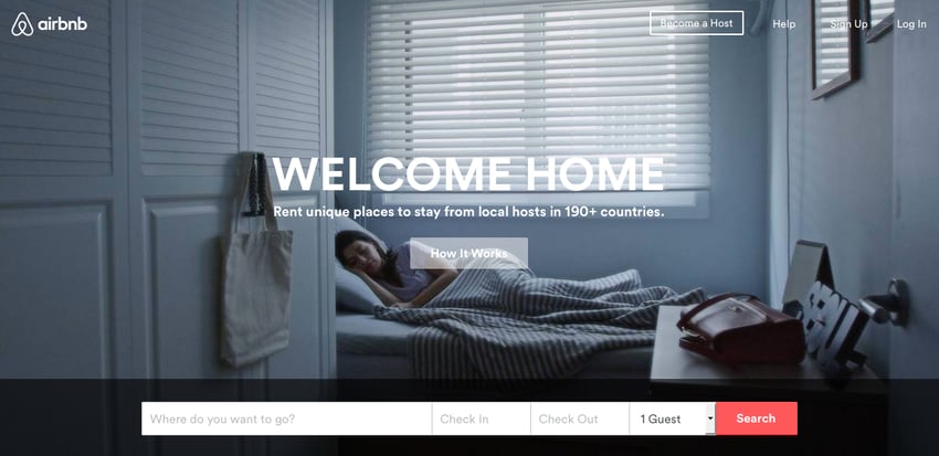
Bigger and bolder was the mantra of websites everywhere in 2010. Designers began to use large text over a large image to grab their visitor’s attention and direct it where they wanted (in the case of Airbnb’s current website, it’s obviously that red search button). This trend is definitely still in vogue with the large image getting even bigger with hardly any other content above the fold.
2) Minimalism
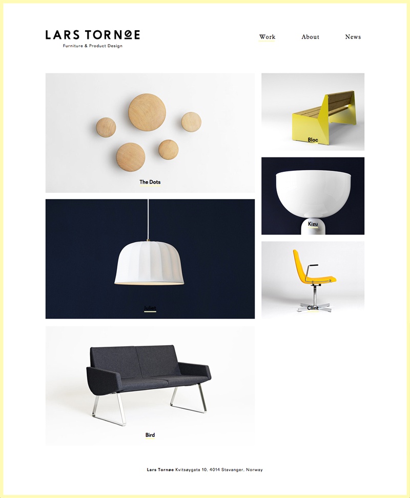
Simple. Clean. Elegant. After the information overload that dominated websites for years, in 2010 the pendulum swung to more minimalist designs, especially for designers and marketing agencies. Lots of whitespace is a hallmark of minimalism as well as a more selective color palette.
3) Textured backgrounds
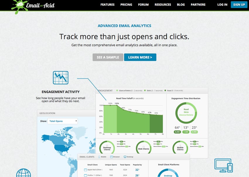
When CSS3 and HTML5 were released, designers gained more control over every little aspect of a website. Wanting to create a more textile web experience, backgrounds for at least sections of a website changed from white (or a gradient) to textures such as speckled, dots, and grids. This subtle enhancement adds just that little something extra to a website.
4) Specialized fonts

Not too long ago every website used some combination of Arial, Times New Roman, and/or Verdana. Today, with the availability of Google fonts, Typekit, and other services, the font options are nearly limitless. This gives companies the ability to use their corporate font or to make a distinctive statement (perhaps in that bold header) with a unique font.
5) Responsive websites

While smart phones were definitely on the scene prior to 2010, most companies that wanted to cater their website to that medium, had to have a separate mobile site that had to be maintained separately (i.e. every little change had to be made in two places – your normal website and your mobile website).
This model became obsolete with the release of browser and mobile support for responsive website design, which allows companies to have one website design that changes based on the device a visitor is using for a better user experience.
Suffice it to say, responsive websites are an absolute must nowadays as more people than ever before browse the Internet on their phone.
---
Are there any trends from the last five years (or more) that are your favorite? Any website trends you wish would die? Let us know by tweeting us at @smartbugmedia.

Refine your inbound marketing efforts with:
The Ultimate Guide to Inbound Marketing Personas


Other insights you might like