June 8, 2015
Converting visitors into leads is the first step in creating a relationship between your company and a potential customer. The more landing pages you have the better. In fact, HubSpot conducted a recent study that showed that marketers saw a 55% increase in leads when they increased the number of landing pages on their site from 10-15.
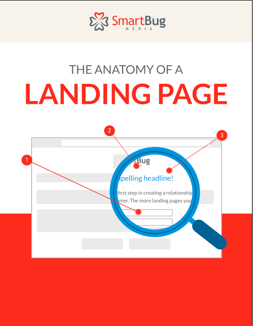
In order to help you get started creating landing pages that are optimized for the best conversion rates, we've created a free infographic for you to print, share, or save! But first - here are some key best practices to remember.
Tips for Creating Killer Landing Pages
-
Create a Compelling Headline: You need to develop a headline that will capture the visitor’s attention immediately and make them want to read on. It’s the first thing they’ll see when they get to your landing page and you don’t want it to be their last.
-
Efficiently Convey the Value of Your Offer: Conveying the value of an offer concisely and effectively is crucial to the development of your landing page. Ever heard of the Blink Test? The blink test basically states that you need to convey your message and value before your visitor has time to blink, or between 3-5 seconds. If you don’t do this successfully, you risk losing that conversion as that’s typically the amount of time it takes for somebody to decide if they want to stay on your landing page or not.
-
Include Bullet Points: For whatever reason, us humans like to mix things up and have short attention spans for things like landing pages. To keep your reader engaged, avoid writing lengthy paragraphs on your landing page. Write a brief summary of the offer and below it, list out bullet points of what the visitor can expect to read by downloading the material. Providing a few bullet points on this will keep the reader engaged while also giving them a preview of what’s to come, which can entice them to convert.
-
Build the Form: When you create the form for your landing page, be mindful of the number of form fields you are including. The number of form fields you have should correlate with the stage of the buyer’s journey. Typically, on an awareness piece, you want to keep the forms brief and get basic information such as name and email. The further down the funnel your content is, the more fields you should considering adding as they are getting closer to buying. Once they’re at the intent stage, you’ll want to get more information from them to help the salesperson understand the contact better so that they are better able to close the sale.
-
Remove Site Navigation: When building your landing page, you want to remove any opportunity for your visitor to leave the page. By removing site navigation from your landing page, this will allow your visitor to solely focus on the content at hand, rather than becoming distracted from other enticing links on your site.
-
Insert Images: Who doesn’t love a good image? Be sure to include a relevant and engaging image on your landing page to draw in the visitor. People are more likely to stay on a page if a captivating image is present.
-
Add Social Sharing Icons: While you should remove all navigation from the landing page, it’s important you include social sharing icons so that people can share the landing page with others across their social platforms. When you do this however, be sure that when you click on the icon it opens in a new tab or window. You don’t want to redirect people away from the page but you want to give them a clear option to promote it.
-
Provide Testimonials When Relevant: These days, people are always looking at reviews of products and services before making a purchase, and this can apply to landing pages as well. However, don’t include a testimonial that vaguely ties into your offer. Make sure it directly correlates to what you’re promoting. If it doesn’t, it’s best to leave it off. The same advice goes for placing awards and accolades on your page.
-
Make Sure Your Instructions on Next Steps Are Clear: While a form on a landing page typically implies that you should fill it out, be sure to include copy that suggests this on your landing page as well (typically near the end of your copy). This could be something as simple as, “To access the ebook, please fill out the form to the right.” It’s simple, but it gives your visitor clear instructions on next steps which will make them more likely to convert.
Hints from the Pros
Below are some pointers to consider that many people may forget to tell you, but they can make all the difference in the world for your landing page:
-
Proofread: We wish this was a given, but unfortunately that’s not always the case. You need to look credible when somebody visits your landing page. If you mix up “their” and “there,” it looks sloppy and can deter people from converting. Triple check everything on your landing page. If you know you’re bad at editing, ask somebody else to do it. It’s important.
-
Aim to Keep Your Copy Above the Fold: While this isn’t set in stone, the longer the copy on the landing page is, the less likely you’ll be to keep somebody’s attention. Aim to be concise with you message and keep everything above the fold.
-
Test Your Landing Page: Again, you’d think that’s a given, right? It’s not. Once you’ve developed a CTA that links to your landing page, and a thank you page that it redirects to, test the full process. Click on the CTA, fill out the form, and download the offer on the thank you page. Make sure all steps are truly in place from a user perspective, and confirm your contact info has been stored in the database to ensure everything is function from a back-end perspective.
The Anatomy of a Landing Page Infographic


Place the right content in front of the right people with:
Mapping Content For Different Buyer Personas


Other insights you might like