July 21, 2015

Landing pages are used in the inbound marketing funnel to collect visitor information, nurture prospects and generate qualified leads. And whether it's delivering premium content, inviting to a webinar, or taking information/demo requests, the goal for a landing page is always the same - get the reader to take the next step. How are your landing pages performing? Are they successfully moving prospects through the funnel and generating quality leads? If not, here are some landing page tips that will help you increase conversion rates.
Grab Their Attention with a Headline
The headline is often the first thing that readers will see when they arrive on the landing page. It's also the first opportunity to "sell" the reader on your offer. Will they learn something new from the offer? Will the information save them time or make them more efficient at something? Consider any pain points that your offer will resolve and address them in your headline. Use a statement that's short, simple and clear on what they'll gain by completing the action you want them to take.
Also, consider using a sub-headline to provide some additional context and entice them to continue reading.
Persuade Them with Words
If your headline caught the reader's attention, they will likely seek out further explanation in the body of the page before deciding to fill out a form. As the reader reads (or skims) landing page content, they're essentially looking for one thing: what they're going to get if they give up their time and contact information by filling out a form. Tell the reader why your offer is valuable. Keep it to one or two brief paragraphs and use a bulleted list to emphasize the benefits of your offer. Close with instructions on how they can receive the offer.
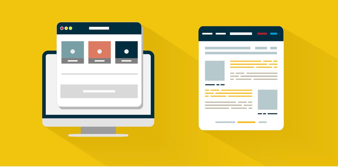
Show Them an Image
The brain processes images 60,000 times faster than text. So it's a no brainer (sorry for the pun) that adding an image will quickly provide context to the action you want the reader to take. Is your offer premium content that you want the reader to download like an e-book or whitepaper? If so, provide a thumbnail image of the cover or first page. Show them a preview of what they will have access to once they complete the form.
Collect Their Info
Forms are a vital piece of the inbound marketing process. They are an action step between the different stages of the funnel and they can help marketers collect insightful information about the prospect. With so much valuable information to collect, keep in mind that in order to get prospects to convert on a form, the perceived value of your offer must be greater than the pain and agony of filling out a form and giving up information. That is to say the more questions you ask on a form, the less conversion you'll have. The same goes for heavy questions that ask for budget and sales cycle information. The same also goes for difficult or complex questions that take too long to answer. How many fields are on your form? What information are you asking prospects to give up? How long does it take to fill out? Would YOU give up your valuable time and information for whatever the offer is? When in doubt, start with the basics and progressively move towards more qualifying questions. HubSpot makes this really easy to do automatically.
How are your landing pages measuring up so far? If you have the basics covered and still think there's room for improvement, here are a few additional tips that can help improve landing page conversion rates:
Eliminate Distractions with a Clear Conversion Path
For anyone that arrives on your landing page, there should be very few options: convert, share or exit. Having other links on your landing page can distract the viewer and divert them away from what they originally clicked a CTA to do - which was to receive your offer. Before providing them with other links, get them to convert on your original offer first. Then use the "Thank You" page to continue the conversation with other content and options.
Point Out the Next Step with Directional Cues
Eye-tracking studies show how common browsing patterns follow various directional cues like pointing arrows and the gaze of other faces. Using these directional cues on a landing page can affect how viewers read the landing page content and ultimiately make a decision. Check out this article to read more about the power of directional cues.
Test, Tweak, Repeat
Passionate, hard-working (SmartBug) marketers will say there's always room for improvement. So as you examine your landing pages, consider elements that you can easily edit and A/B test them one at a time. You might find that a simple change in verbiage or using a red form submission button instead of blue increases conversions by a small percentage. Maybe you'll make a surprising discovery that increases conversions by a large percentage. The point is that by making small adjustments over time you can fine tune your landing page for better performance.
What A/B testing have you done on landing pages? What were the results? Share your success stories and thoughts in the comments below.
Refine your inbound marketing efforts with:
The Ultimate Guide to Inbound Marketing Personas


Other insights you might like