
April 23, 2018
Infographics must be visually pleasing. If the graphic doesn’t invite you to continue down the page to learn more, it isn’t worth much in my book. I also eat, sleep, and drink marketing, so when I find an infographic that teaches me something in the realm of marketing and does it in a beautiful or unique way, I sit up and take notice. Below are 10 I have recently run across (or frequently revisit) that lay down some marketing fundamentals:
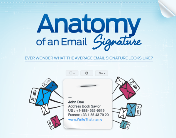
1. Anatomy of an Email Signature
Forbes featured an infographic from WriteThat.name (now called Evercontact). In the infographic, WriteThat.name starts with an analysis of over 700 million emails to look at what the average professional puts in their email signature. From there, they discuss how to construct the perfect email signature. It is a great reminder of an often overlooked piece of marketing that is sent out with every email: your signature.
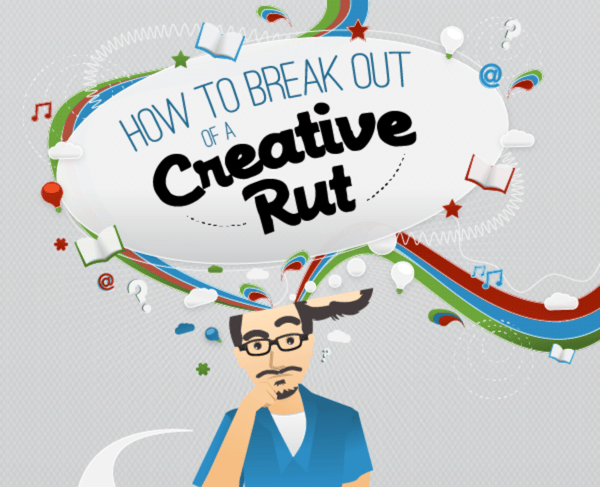
2. How to Break Out of a Creative Rut
This next infographic is from CopyBlogger. I can’t give this one top marks for design work because some of the graphics are a little underworked, but all in all CopyBlogger worked hard to visually unpack a marketing process. As a designer myself, I know how long it took them to develop this piece, so hats off.
As for the content itself, CopyBlogger put together a great list of ways to get unstuck in your creative processes. If you are a content writer, this will be handy to have around for those times you hit a block.
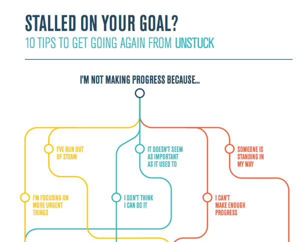
3. Stalled in Your Goal?
Unstuck came up with this flowchart to help you get, well, unstuck. While it does not directly relate to marketing, every marketer can relate to having a project stalled and needing to find a way to get it moving again. I love its elegant simplicity and use of white space. What’s more, the steps it puts forward have helped me get unstuck countless times.
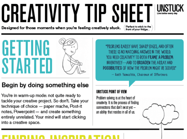
4. Creativity Tip Sheet
If you can’t tell, I am a fan of Unstuck. This next infographic is another of theirs and features ways to find your creativity. Its common sense approach to coaxing out the creativity in all of us is fabulous, and the use of simple, uncluttered graphics and fonts makes each point clearly defined and digestible.
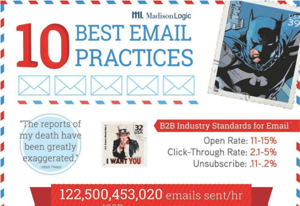
5. Email Marketing Best Practices
I wish I had created this infographic by Madison Logic (which you can now only find on Marketing Profs). It is beautifully illustrated and has time-tested advice for those looking to create compelling emails. While it only lives on Marketing Profs these days, it is a great read for those looking to craft effective emails.
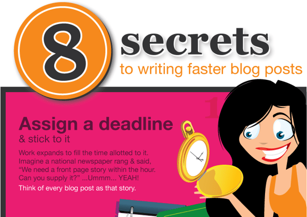
6. Tips for Writing Blog Posts Faster
This next graphic comes from Australia and can be kept under “writing fundamentals” in your bookmarks. There is nothing earth-shattering in the content, but it is it a well done infographic, and let’s face it, we all need to be reminded of the fundamentals more than we need to learn some trendy new technique.
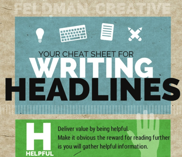
7. Cheat Sheet to Writing Headlines
I am a sucker for content that spells out a word, as this next infographic does. Don’t get me wrong—it has to be well done and not force concepts where they don’t belong—but curiosity gets the best of me and I have to read all the way down to see how they fit all of their points together.
In this case, it doesn’t hurt that the topic is dear to my heart: writing compelling headlines:
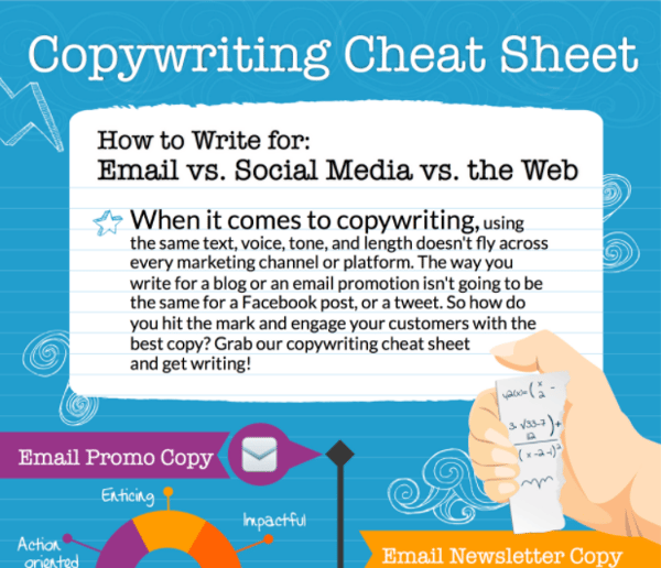
8. Copywriting Cheat Sheet
VerticalResponse give us our next infographic. It is a great cheat sheet for those who write a lot of social media content. After a while, one post can start to look like the rest. This infographic is a good refresher on the different audiences you are speaking to and how to best reach them.

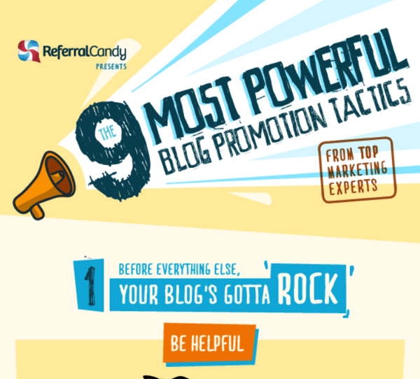
9. Nine Most Powerful Blog Promotion Techniques
While most of these techniques are “old hat” for those that have been in the game for a while, this next infographic from ReferralCandy is a great resource to come back to, because no marketer—no matter how good they are—will use all of these techniques all the time. It is good to be reminded of techniques you have not used in a while or ever before.
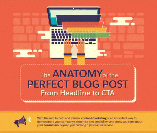
10. The Anatomy of a Perfect Blog Post
I saved the best for last in terms of execution. One complaint I have regarding infographics is that they can be a lot more info and and lot less graphics. This is not the case with this infographic from Salesforce. The graphics are well executed, perfectly balanced, and paired with timely information.
It simply spells out the process by which you construct a beautiful, appealing blog post that will engage readers and convert visitors to leads:
I hope you enjoyed this roundup. Use these infographics to remind yourself of the fundamentals, get unstuck, or inspire yourself toward new creativity. I sometimes use them to be inspired by the creativity of others. They help me get unstuck and I remember good tidbits of advice in the process.
Photo by Godisable Jacob from Pexels


Refine your inbound marketing efforts with:
The Ultimate Guide to Inbound Marketing Personas


Other insights you might like